Scientific Drawing Completed
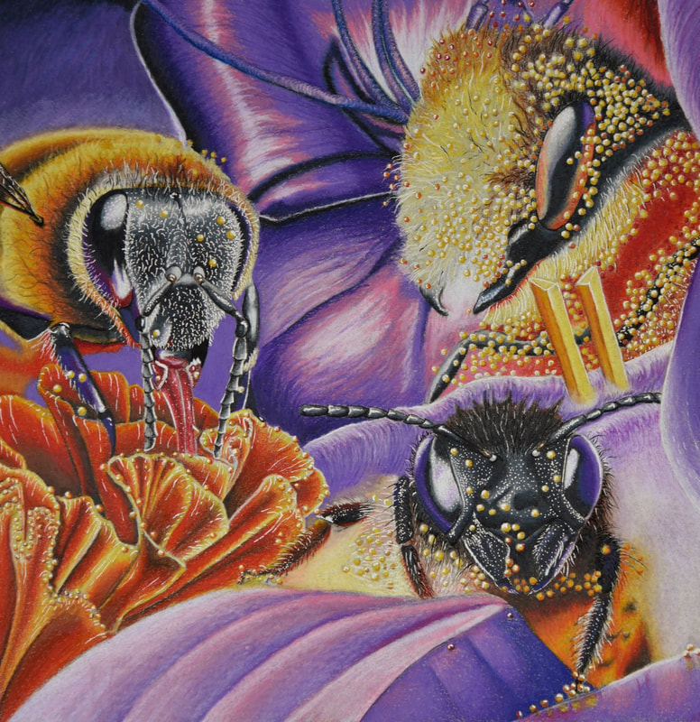
Not really sure what to say for this one. Of all of my works this one took the longest. Of all my works this is definitely my best and favorite. I used Prisma colored pencils for the majority of the piece, and used a white gel pen and a micron pen for the bright whites and dark shadows. I really like how the orange/purple color pallet turned out. There's not too much that I hate about the piece. Some areas are a bit streaky, and some other areas haven't quite reached the "burnished" stage yet, but I feel like those small areas are pretty unnoticeable, especially with how well the rest of the piece turned out.
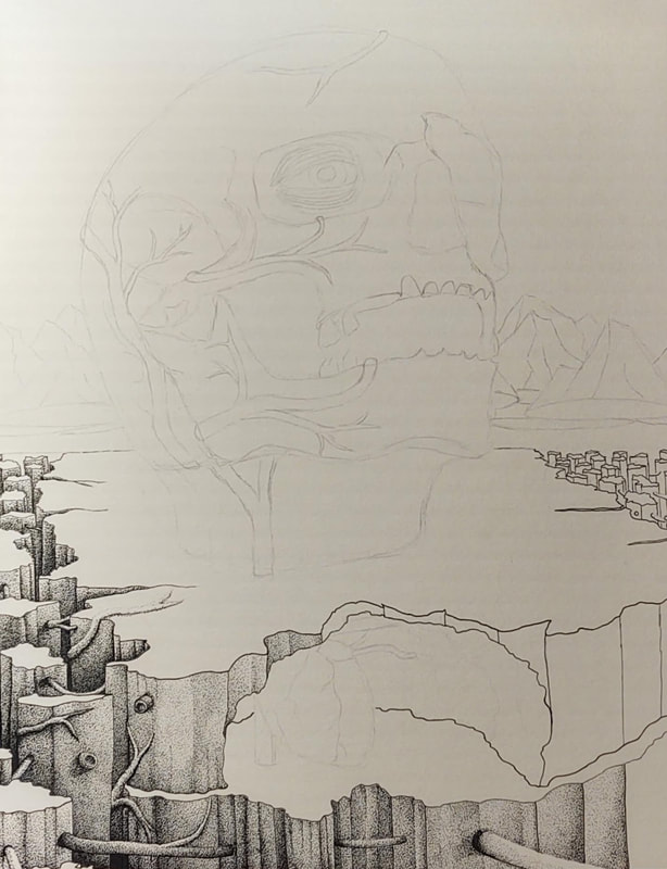
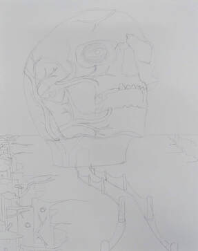
Since starting this piece, I have not touched the surrealist piece. I'll likely resume it when I find the time, and use it towards my AP portfolio.
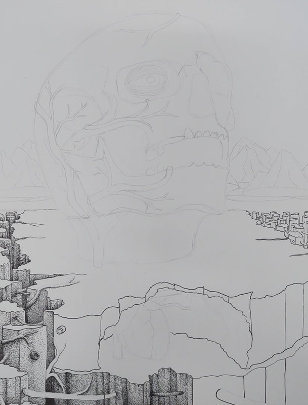
Since starting this piece, I have not touched the surrealist piece. I'll likely resume it when I find the time, and use it towards my AP portfolio.
Scientific Drawing and Surrealist Project - Quarantine Week 5
|
|
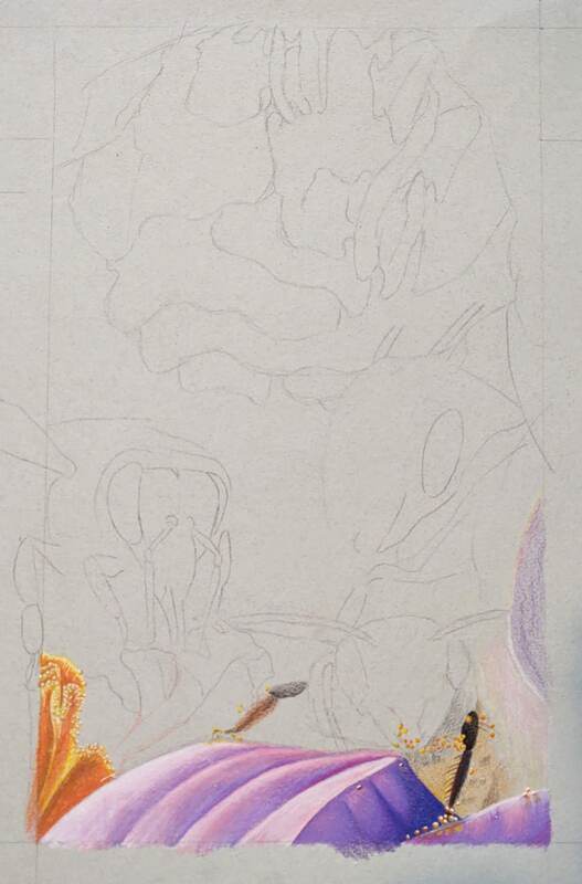
Over spring break, we were given several options for new projects to start on. I've always liked botanical drawings and textbook diagrams so I chose the scientific drawing theme. I knew that I wanted to do something with bees so I sketched up (what I would consider to be) a hodgepodge of bees and bee hives, in an attempt to go for that botanical/textbook aesthetic that I admire. I, thankfully, realized that my composition was way to busy and opted for a more creative composition that somewhat strayed from the theme. I found some photos online of bees covered with pollen that looked like they'd be good subjects to draw, so I sketched them out on a sheet of blue paper and went from there.
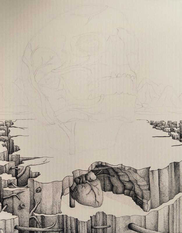
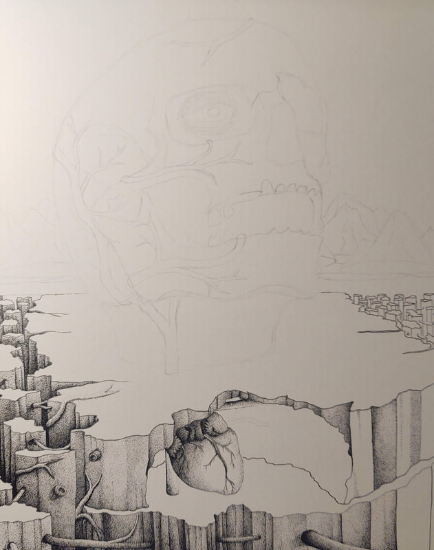
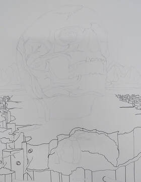
I continued to stipple the cave in my pen and ink project. I'm turning this project into a side project so I can focus on pieces so that I don't become burnt out.
I continued to stipple the cave in my pen and ink project. I'm turning this project into a side project so I can focus on pieces so that I don't become burnt out.
Surrealist Project - Quarantine Week 4
|
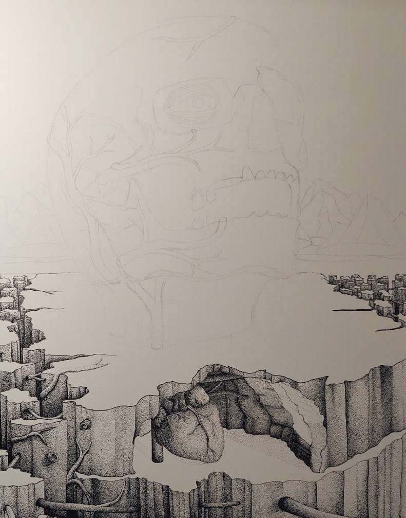
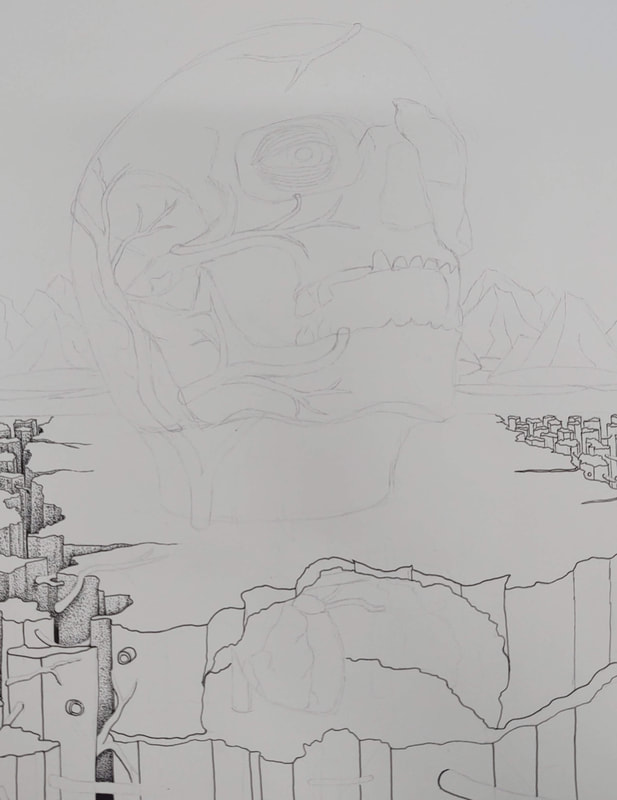
I finished stippling the front face of the cliff, and continued shading in the cave area. Since the cave is circular, I'm making sure to include a cast shadow from the front walls of the cave.
|
Surrealist Project - Quarantine Week 3
|
I began to stipple the heart and I'm not too happy with how the proportions came out, however I do like the textures that I was able to create on the heart. And, of course, I continued to stipple the face of the cliff.
|
Surrealist Project - Quarantine Week 2
|
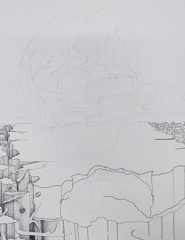
I still wasn't happy with how light the stippling was on the pillars, so I continued to shade them in. I also used strokes to bring in the dark blacks that I wanted in my piece. I also continued to stipple the face of the cliff.
|
Surrealist Project - Quarantine Week 1
|
I continued to darken the pillars on the left, and expanded the stippling onto the face of the cliff.
|
Surrealist Project - Week 2
|
|
I began to stipple the leftmost landscape features. Half way through the week, I realized that the stippling was not dark enough so I spent the rest of my time correcting my mistakes.
|
Surrealist Project - Week 1
|
|
I began sketching the final composition and realized that I didn't care too much for the trail, so I changed the landscape to reveal a cliff and cave which holds a heart. I also began outlining the composition.
|
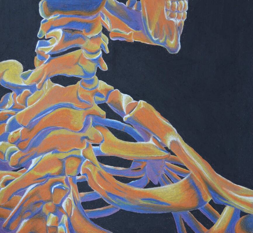
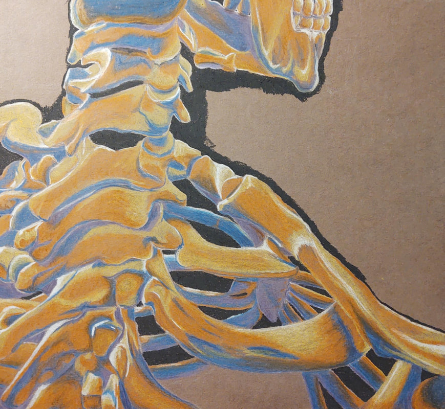
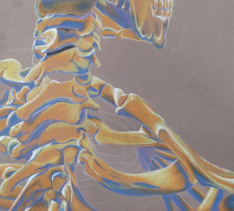
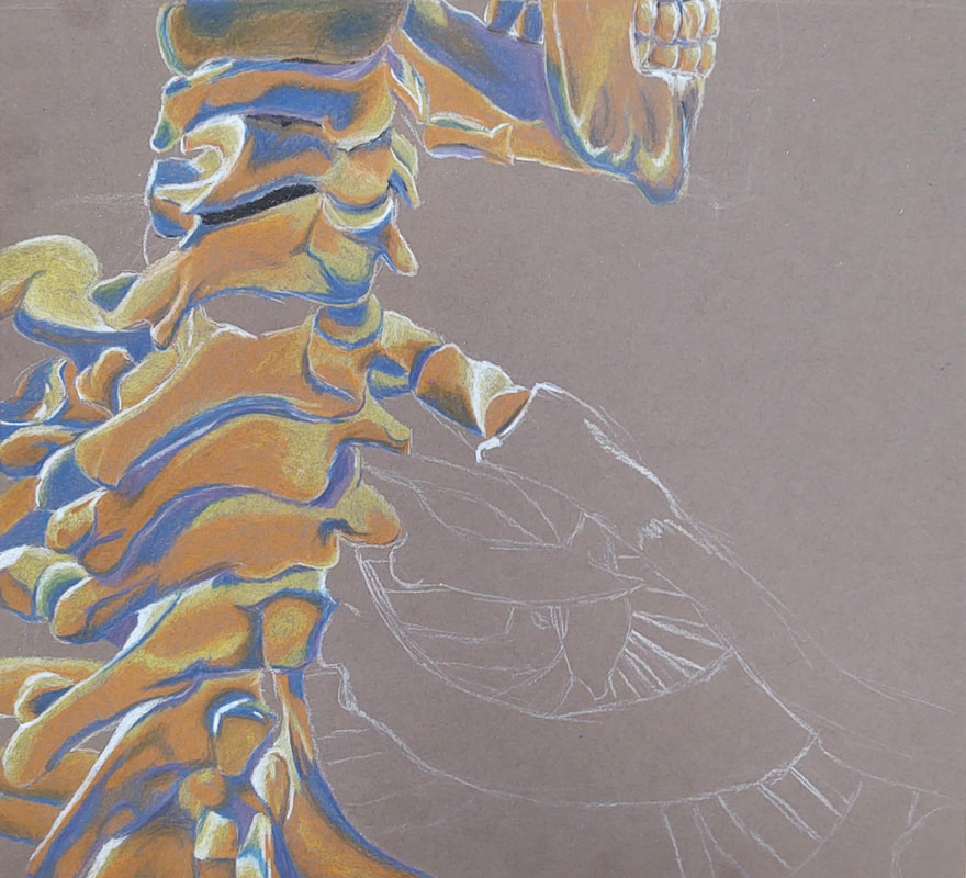
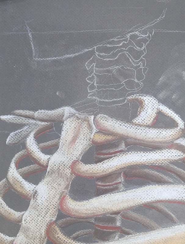
February 26th 2020 - Human Skeleton Practice Drawing-2
|
|
|
|
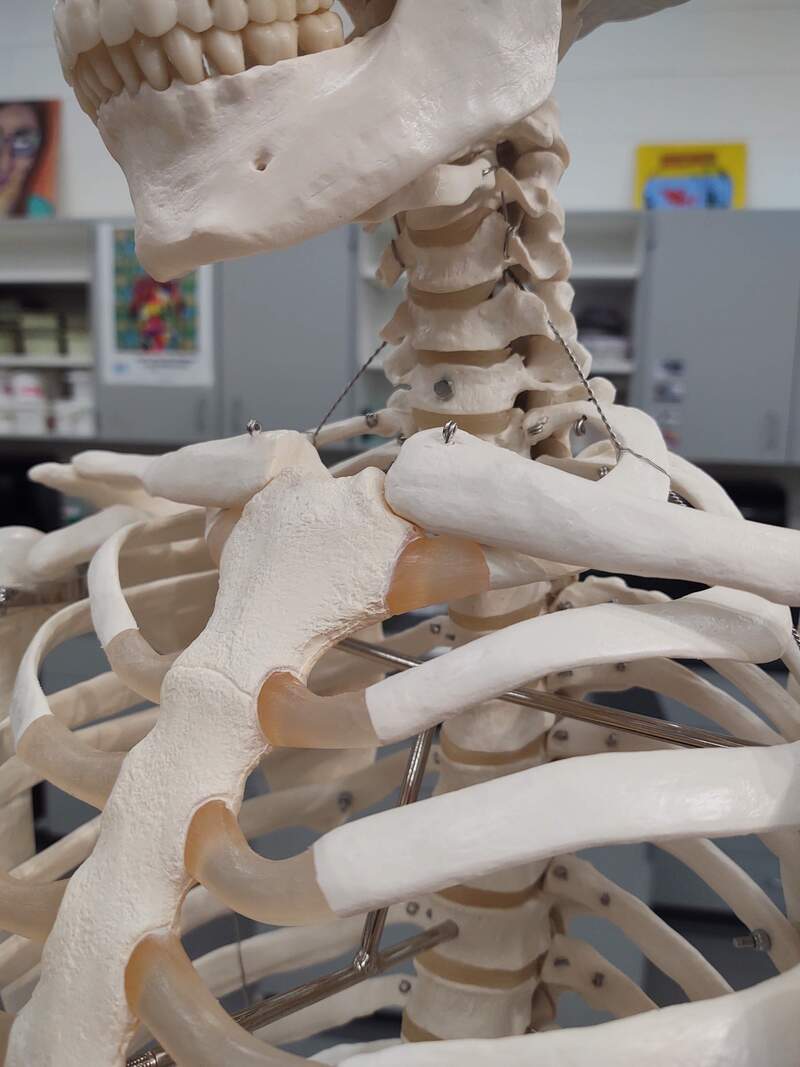
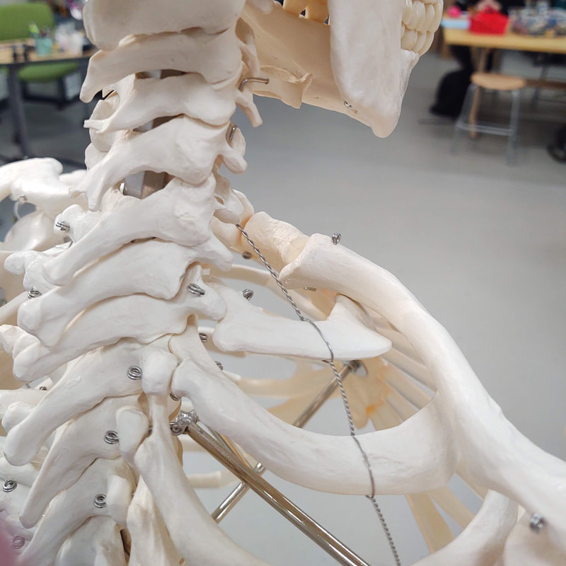
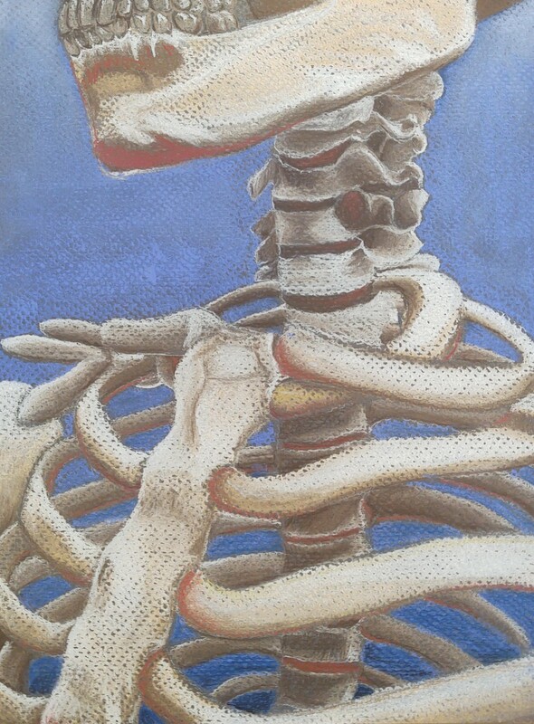
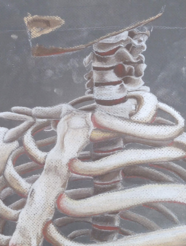
I opted to do another "practice" drawing of the human skeleton so that I could be better prepared for the final piece (though Mrs. Rossi waved off the final piece due to the quality of the two practice drawings) . The goal of this was to study the proportions of the human skeleton, and learn more about the underlying anatomy of the human figure. Unlike the last practice drawing, I exclusively used chalk pastel pencils. By using the pencils, I had a lot more control over where the color went than I did the chalk sticks, which allowed me to realize more detail of the reference photo (below). I ended up not doing a lot of blending since that muddied the colors quite significantly (seen on the bone on the top of the spine in the first three photos), so instead I took a cell shading approach, mildly blending between the color borders. I don't think that the purple lends itself well to the piece, and I should have stuck with using blue on the shadows. I was originally happy with just the brown paper background but decided that the colors would pop out more if they were against a black background. This also allowed me to recede some of the lines that were still showing through on the brown paper, making the final thing look a lot more clean.
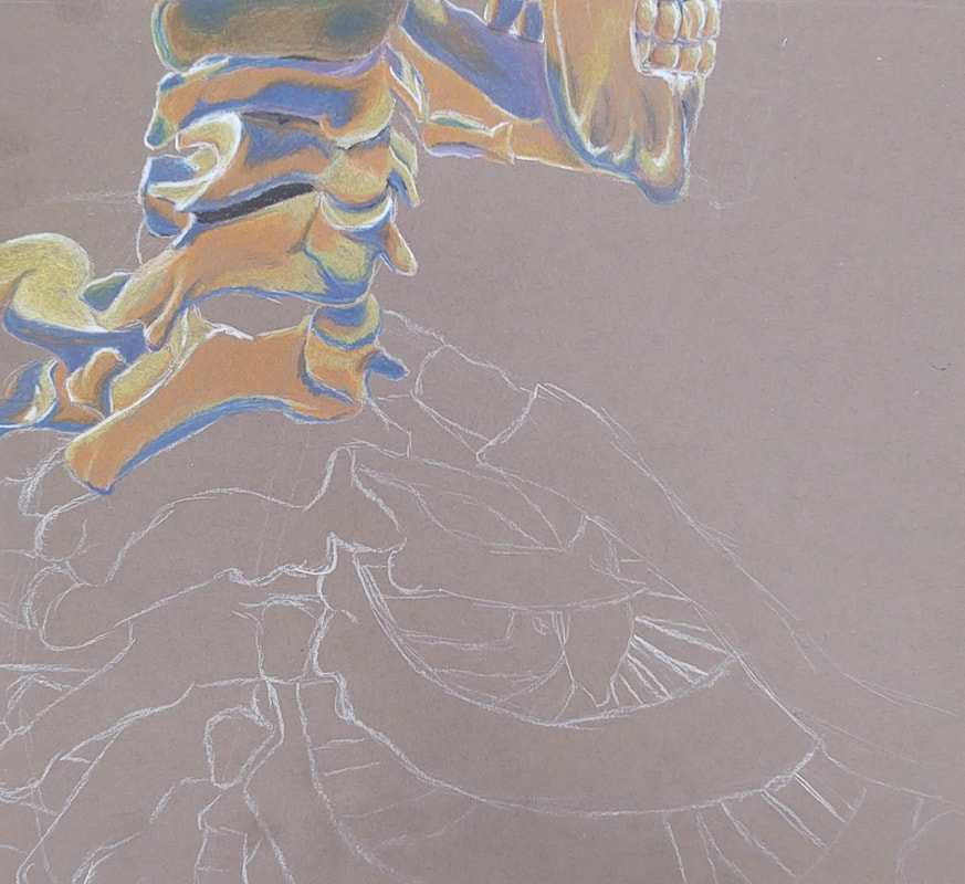
February 18th 2020- Human Skeleton Practice Drawing-1
|
|
|
This is a practice sketch of a human skeleton that I did in order to learn about human anatomy, and to prepare me for a final, bigger pastel drawing of the human skeleton. Although I prefer pencils, I used stick chalk exclusively on this piece. The paper was quite particular and whenever I'd use the pastel pencils, I'd end up lifting up more chalk that I would place down. When scaling up for the final, I'll make sure to pay close attention to the proportions of the bones, and how big they are in relation to each other. I feel like my shading was quite good but the overall anatomy looks a bit strange. The neck, I feel, is done quite well; it has good depth though the shape of the bones could be improved. Lastly, I colored in the background blue, blending in white at the top and a darker blue at the bottom in order to make a gradient.