A Brief Moment of Clarity
|
|
|
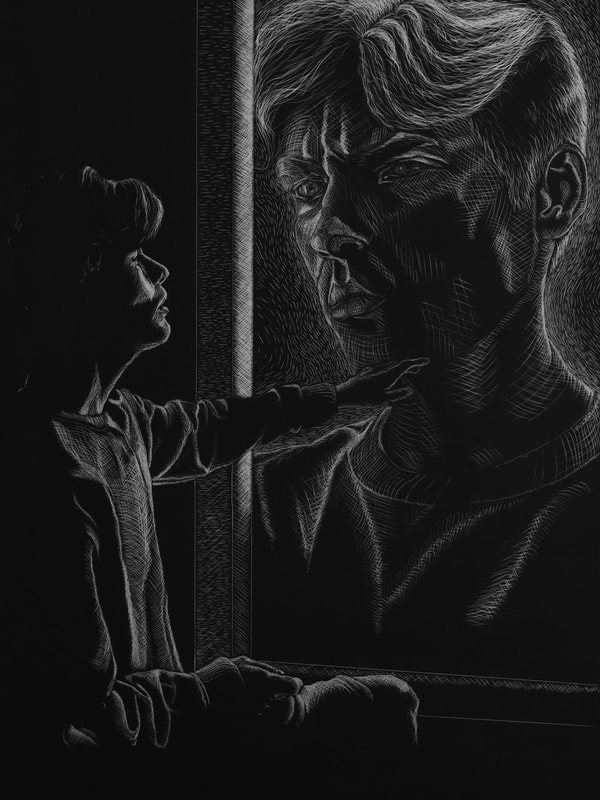
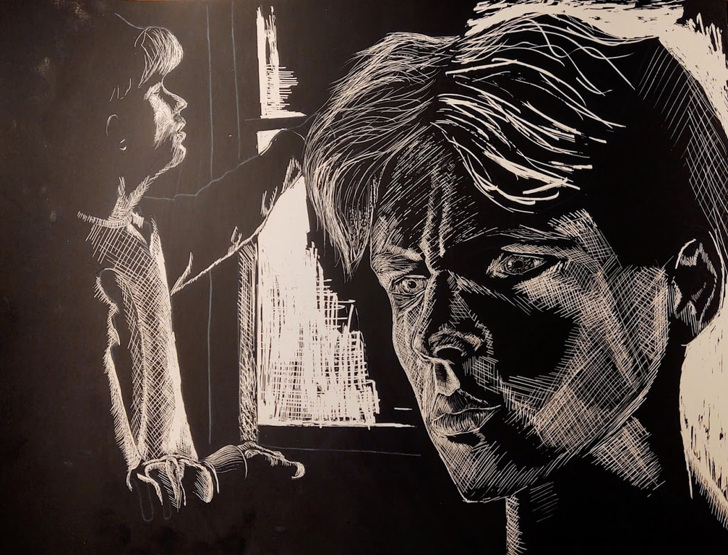
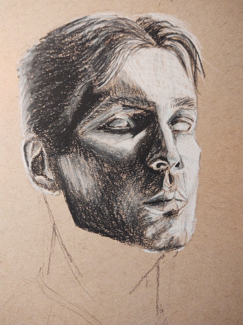
This is my second completed AP portfolio piece, which will be 9th in the portfolio. In the context of the portfolio, this piece aims to depict the first, subtle, realization that Adam (what I have named the smaller figure) is a false identity. He is confused and in awe because he doesn't understand that the figure looking into the window is his true self, but the thought that he is a false identity never crosses his mind. He understands something is wrong but doesn't know what.
I wanted this piece to be very dramatic so I used scratchboard to achieve dramatic highlights and shadows. I am very happy with how Adam is seemingly melting into the black around him. Similar to the technique of my portrait, I sketched the facial planes onto my reference photos which helped me replicate my likeness. As practice, I drew on a piece of scratch paper, and found a good technique with using contour lines to render my face. I refined this process in my final piece. I predominantly used contour lines to generate shape, and lines that ran counter to the contour lines to generate value. For the textural elements of the composition (the cuffs on my sleeves, and my hair) I used the textures themselves to generate form and value.
I am very pleased with how the final work turned out. I rendered my facial proportions with a high accuracy, and I am particularly proud of the eyes on the larger figure. I am very pleased with the stylistic choices I made, mainly with the extreme highlights and shadows. I do notice slight compositional asymmetry. The right side of the composition is very developed with lots of textural elements, and a wide range of values, while the left side of the composition is very undeveloped with a very restricted range of values. I don't think this detracts from the work however.
Using scratchboard for the first time was interesting. The process of creating the lines with the scratch tool is similar to that of pen and ink, though I am working in reverse. The piece itself didn't take much time (which I appreciated considering my time constraints), only 5 "brief" sittings.
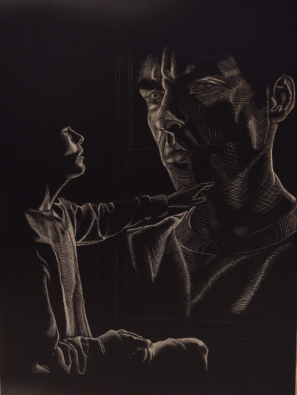
Sketches done on scratch paper
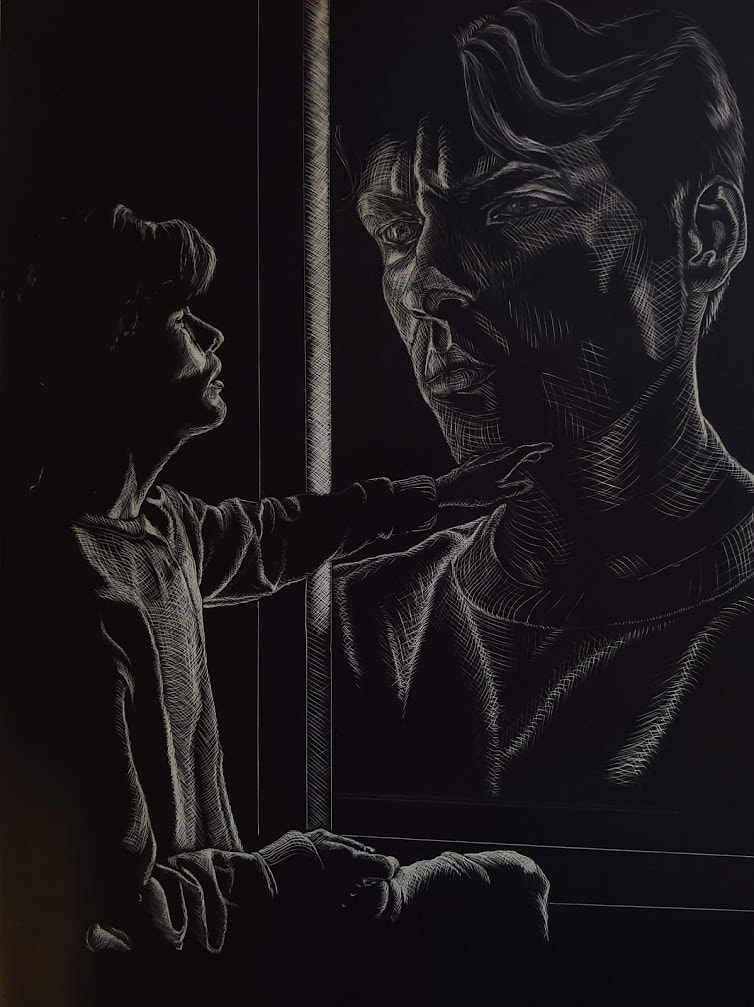
Pseudo- Self
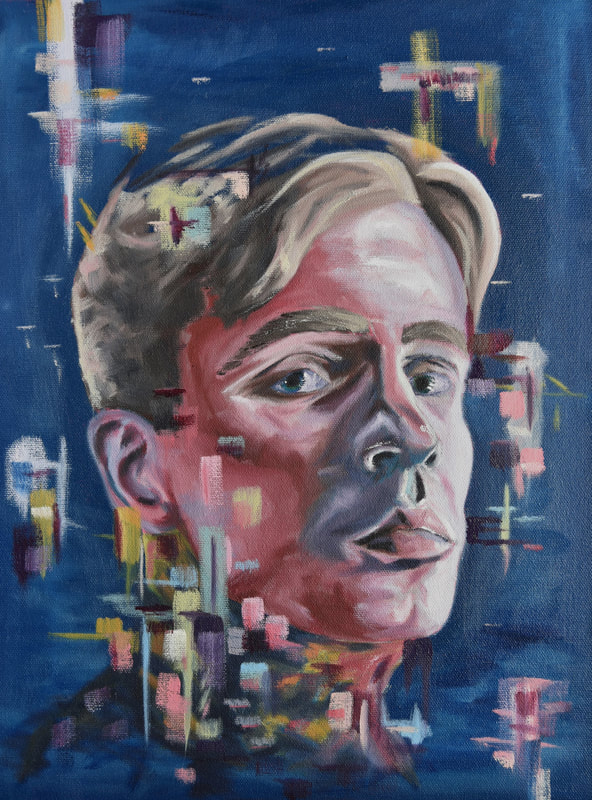
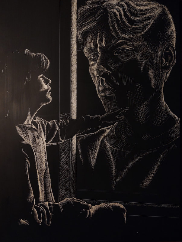
Final painting.
|
|
|
|
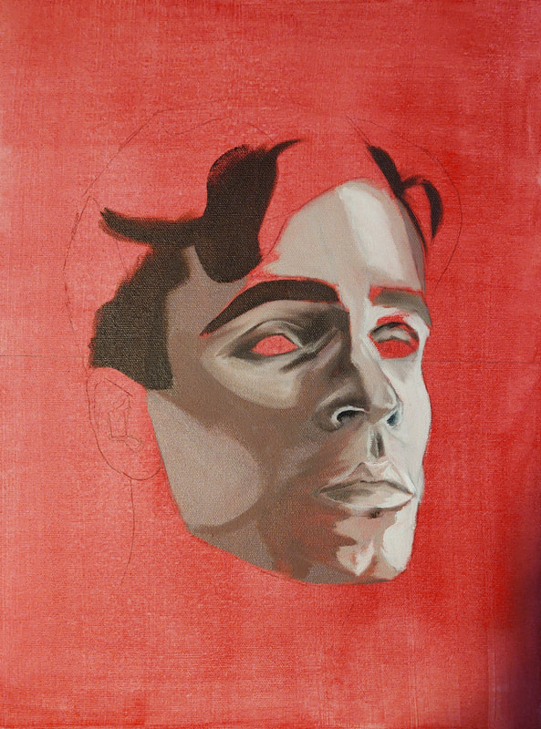
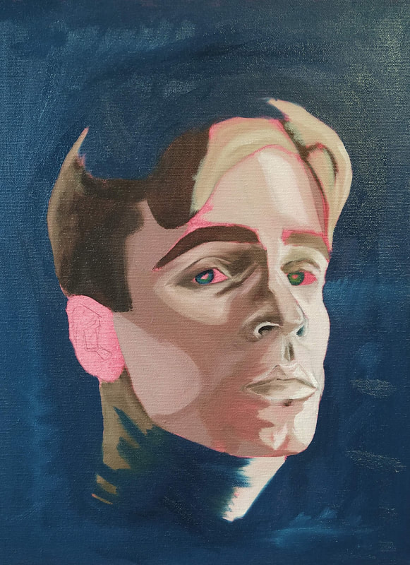
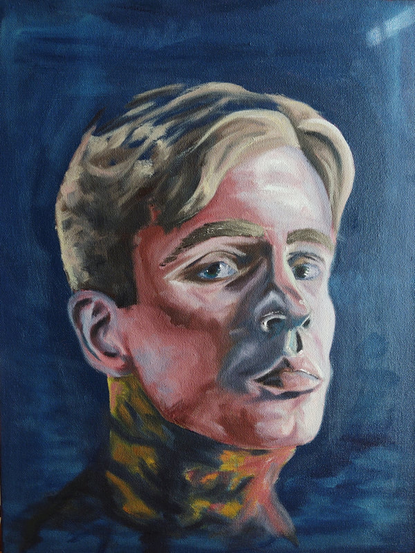
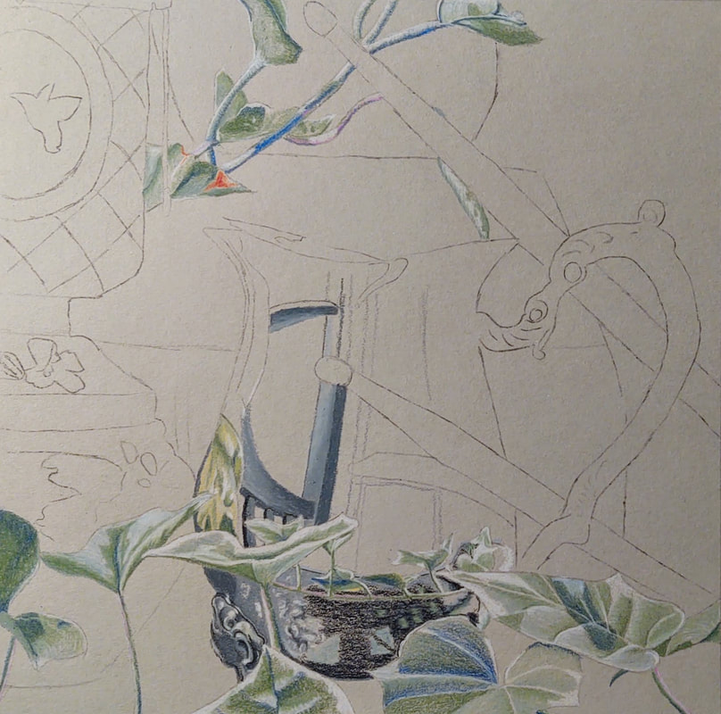
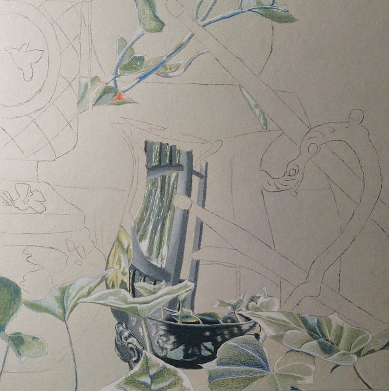
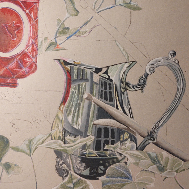
In progress.
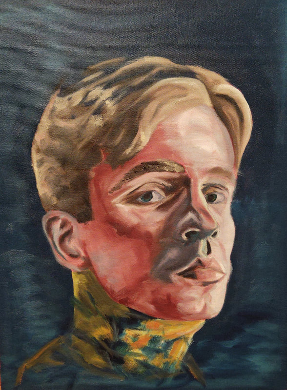
This project was intended to be an "unusual self-portrait". Inspired by David Cambria, I chose to paint myself using expressive colors, and to include tessellations of color on a deep, void background. To begin the project, I took a reference photo of myself using my window as a strong light source. This gave me good reference for the structure of my face. I took a print of this photo and drew the planes of my face onto it. This helped me to better interpret the structures of my face. I took these facial planes and drew them onto the primed canvas.
To prime the canvas, I put down an additional layer of gesso, followed by a red acrylic wash.
I began painting soon after, laying down tones using a burnt umber and white mixture. This allowed me to establish general values without worrying about the ugliness of my work. I then went over this layer with reds, blues and purples using expressive brush strokes. I allowed my brush strokes to generate the forms of my face, again using my facial plane diagram as reference. Once I had my face completed, I began to lay down colors on my neck and hair. I intentionally left parts of the neck and hair unfinished so that it would blend into the background (I think this worked really well!). Lastly, I used a flathead brush to generate the "skin glitches". I had a lot of fun mixing the paint to achieve a variety of pastel colors, which I laid down in squares and rectangles.
I think the piece is successful in being an "unusual self-portrait". Comparing this to previous works, I notice that a lot of my previous works aim to mask brush strokes. However, I chose to retain the qualities of the brush strokes in this piece. I think this is a big step forward in creating "better art", and at the very least allowed me to create a more visually interesting piece. I believe my use of exaggerated color works really well and that it brings the whole piece together.
If I were to do this project again I would pay closer attention to the form of my face. The left eyebrow is in highlight, when it should be in shadow, and the left eye is a touch droopy. Again, these are minor details but could still be improved upon nonetheless.
|
|
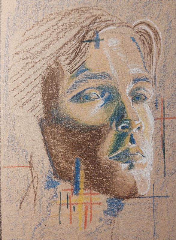
Colored, final composition sketch and black and white practice sketch.
Altered Book
|
|

|
|
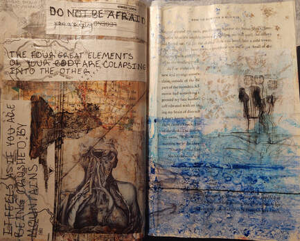
Final four-page spread.
|
|
|
|
In progress.
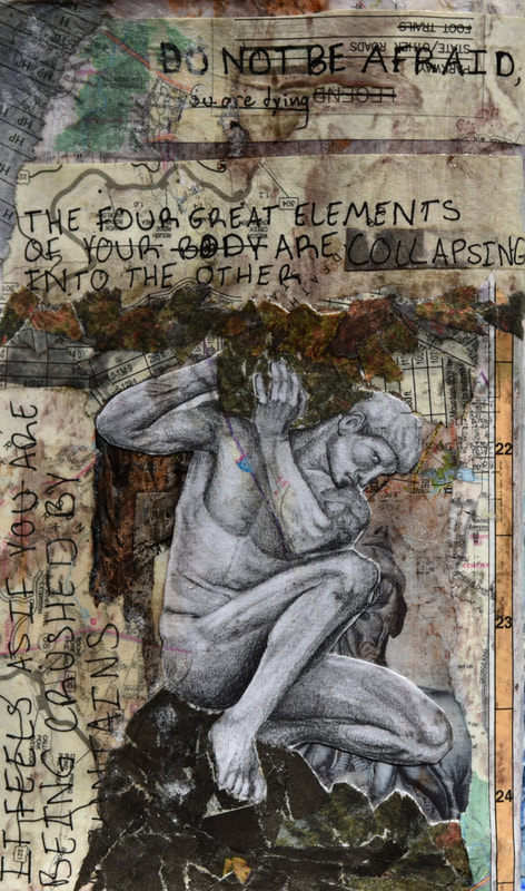
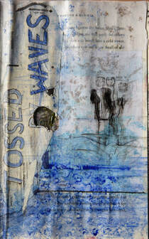
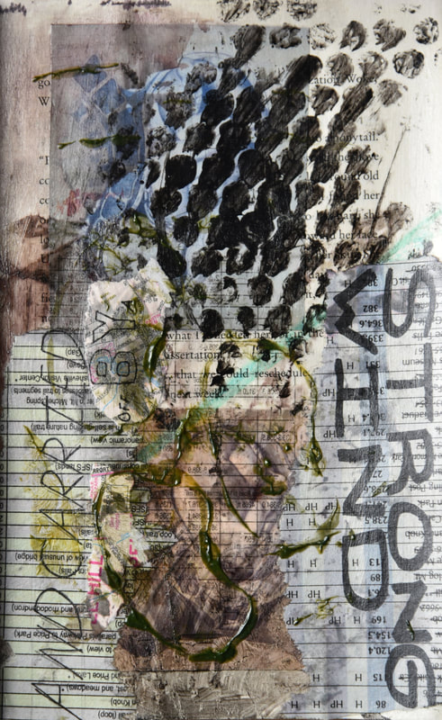
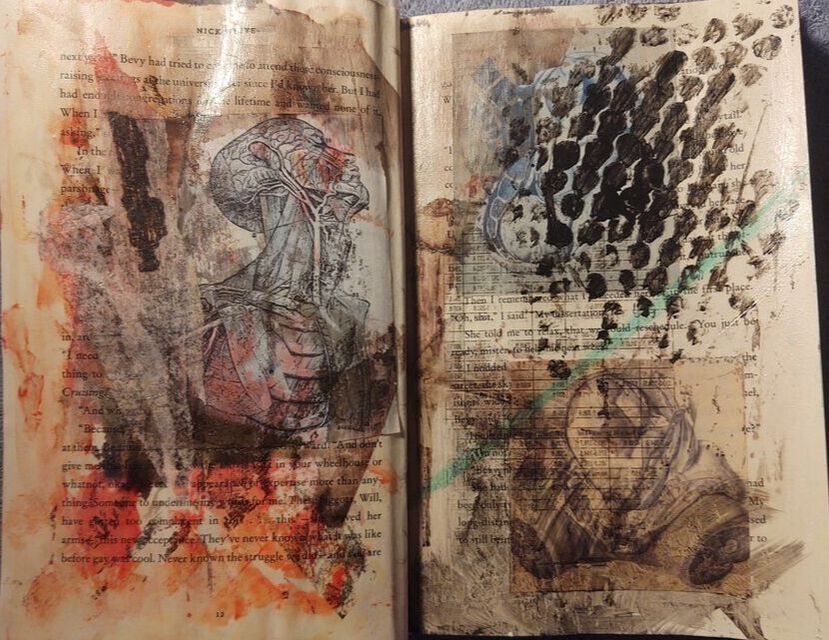
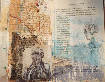
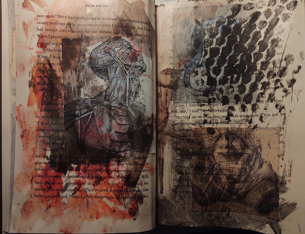
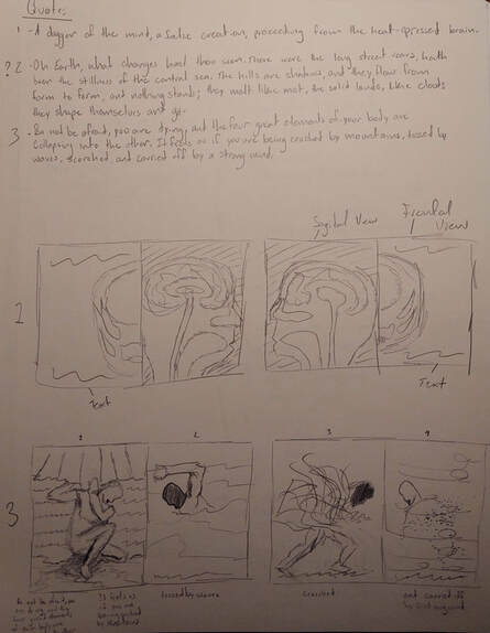
For this project, I had to create a four-page book spread that involved some kind of cut-out. Whatever was underneath the hole on the fourth page was going to be evident on the second page, and whatever was under the hole on the first page was going to be evident on the third page. this made planning the piece more difficult than usual. My final spread was inspired by a quote from the Tibetan Book of The Dead, "The four great elements of your body are collapsing one into another. It feels as if you are being crushed by mountains, tossed by waves, scorched, and carried off by a strong wind." I discovered this excerpt from a song I came across a few years ago, and found the quote to be very eloquent and mysterious. I tried to embody this with the four page spread. Each of the four stages of dying are depicted on each page.
I used anatomy textbook drawings, maps, tissue paper, and graphite drawings in my compositions. I found that the textbook drawings played well with the concept of life and death, and added compositional interest to the pages. I used parts of maps to build up about half of each composition. I used a combination of actual newsprint pieces in tandem with a transfer method I developed. The transfer method involved me saturating the paper and newsprint piece with gel-medium, merging the two, flattening it with a brush, letting it sit for two minutes, and then peeling of the superficial paper layers- leaving only the ink.
I really like how my graphite drawing turned out on the first page, though I did loose some of the subtle map and anatomy textures underneath him.
The tissue paper proved to be especially helpful when merging the elements of the composition together. I didn't add any raw tissue paper, but rather used the ink on the tissue paper to color my pages. I would saturate the tissue paper and the page with gel medium, merge the two, and put some water on top of the tissue paper. This left only the ink, and created an interesting texture that wasn't overwhelming. Black tissue paper helped me to merge compositional elements together, while I used colored tissue paper primarily to complement the subject matter: brown tissue paper for mountains/earth, blue tissue paper for waves, red tissue paper for fire, and green for wind.
If I were to do this project again, I would make the first page less busy. The main reason why it turned out so busy, was because I added the figure drawing towards the end, forcing me to add additional layers to integrate him into the page. If I had started out with the figure drawing, I would have been able to preserver many of the underlying anatomy and map details that got covered.
In my compositional sketches, I originally planned on creating a figure drawing for each page. However, a combination of lack of time and the fact that doing so would result in the same issues that I created on the first page, ultimately made me decide against doing the three other drawings.
|
Three ideas, quotes, and compositional sketches for two ideas.
|
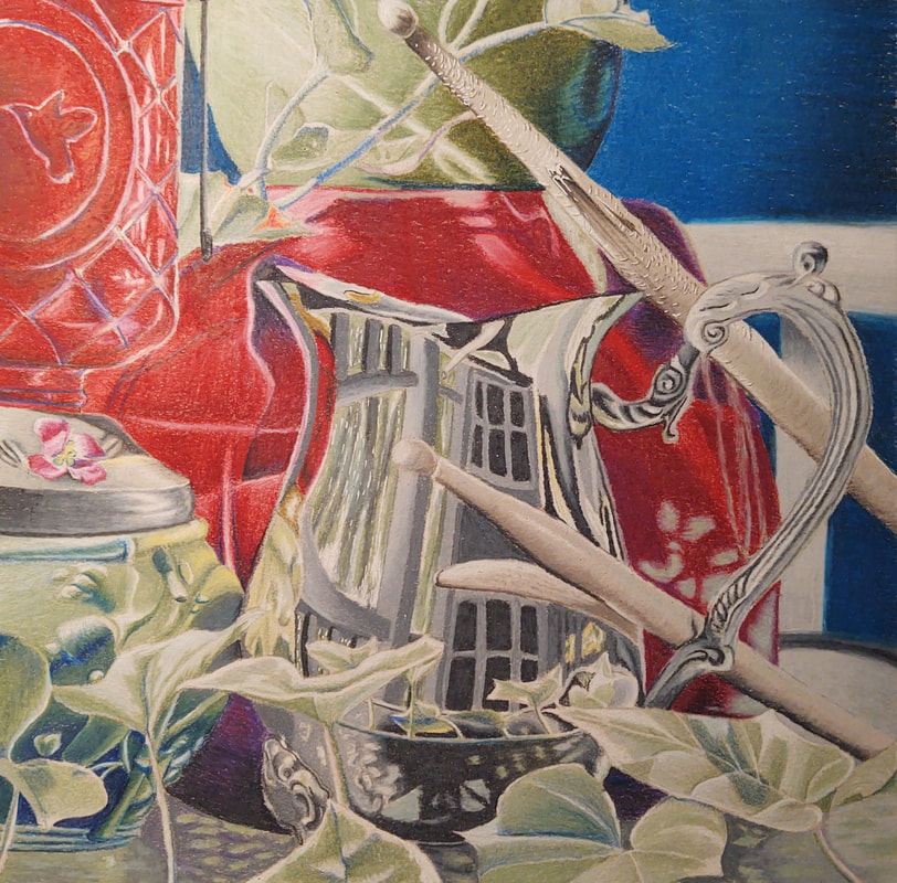
Reflections Drawing
|
|
|
|
|
|
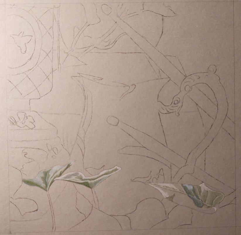
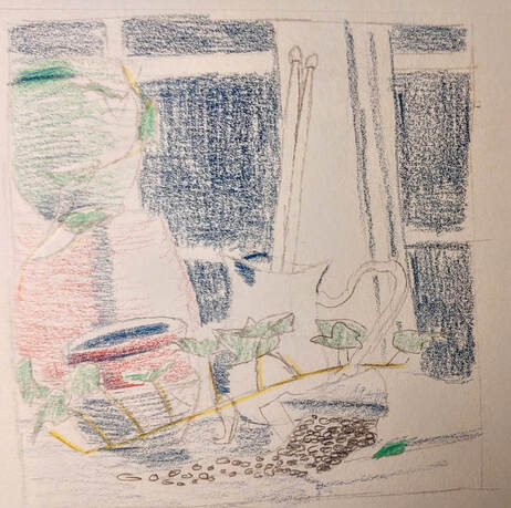
For this project, I was tasked with creating a colored pencil drawing of a reflective object, that reflected my personality in some way. I wanted to do something with gardening tools, and flower pots for my final project. I did two staged photo shoots of miscellaneous flower pots, vines, drumsticks (from a different compositional idea), and a silver pitcher that satisfied the reflection requirement. I took a ton of photos, and experimented a lot with each one. I tried two different settings: on the sun porch of my house, and outside by a bench. The lighting conditions in both settings were very unique, and provided for an interesting composition. I liked the sunporch compositions more as they came out as more "atmospheric" in a way. I tried several different arrangements of the items, at several different angles each. I even tried experimenting with moving elements, bringing in a hose with running water in some of my photos. I combed through the photographs and decided on this photo:
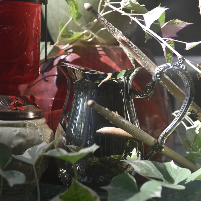
Of all the photos, this one was the one that had the best composition and lighting, and was the one that I felt would be the best drawing.
Certain elements of the photo I chose to omit from my final piece. I omitted the right portion of the vine, as the composition needed some negative space. There were also some weird lighting effects caused by the screened widows on my sunporch, so I purposefully ignored those so that it would be easier to draw.
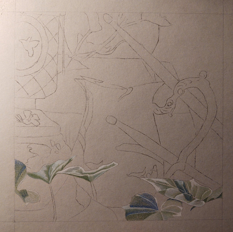
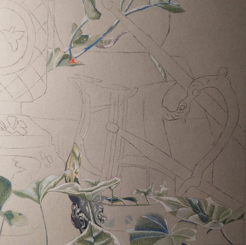
The actual drawing was a slow-going process. I sketched out the composition on grey paper, and started with the leaves. Other students in my art class mistook the white parts of the leaves as highlights- which they are not- and so I'm not sure if I quite succeeded there. After finishing the leaves, I moved onto the pitcher. This was the hardest, but the most forgiving portion of the piece to draw. The abstract distortions in the reflection of the pitcher were tricky to draw, but were mostly forgiving as they didn't have to be accurate to life. After finishing the pitcher, I moved onto the bird feeder and flower pot. The bird feeder had lots of defined highlights and shadows, so I went in and blocked in those areas with a white and purple colored pencil respectively. I then took a variety of reds and pinks and filled in the rest. I feel like the bird, of all the elements in my composition, came out the best. It looks iridescent and bold like it does in the reference photo- maybe just a little on the light side. Anyway, the flowerpot was a little trickier to draw. In the reflection of the pitcher, I drew the flower pot using greens and yellows only, however, if I chose to draw the flowerpot itself using these colors, it would end up blending in with the leaves. I ended up using primarily blue for the shadows, and green on the highlights for the majority of the pot, and transitioned to a green/yellow scheme on the parts closest to the pitcher. The last element of my composition were the drumsticks. Since I had used beaten up sticks in my photo, I wanted to draw them as beaten up. This proved to be difficult, but a white gel pen made quick work of the highlights on the sticks. From there, I really didn't have any complex shapes left to fill in. The background pots, and void were easy enough to color in. They were out of focus so I was able to draw these pretty abstractly which ended up taking less time than the other parts so far.
Like I said before, the bird feeder is the best part of my drawing. The highlights and shadows on the glass, and the base especially came out exactly as I wanted it, and it really does look like it has depth. Looking on the piece as a whole, I should have dulled out the background colors a lot more as they take the focus off of the central elements of the composition. This also caused the compotation to not have as much depth as the photo did.
Overall I think it's one of my better drawings, but not my best. I took my time with the form, but neglected shading somewhat. I'm happy with how it turned out, but if I were given the opportunity to redo the piece, I would definitely dull out the background more.
Certain elements of the photo I chose to omit from my final piece. I omitted the right portion of the vine, as the composition needed some negative space. There were also some weird lighting effects caused by the screened widows on my sunporch, so I purposefully ignored those so that it would be easier to draw.
The actual drawing was a slow-going process. I sketched out the composition on grey paper, and started with the leaves. Other students in my art class mistook the white parts of the leaves as highlights- which they are not- and so I'm not sure if I quite succeeded there. After finishing the leaves, I moved onto the pitcher. This was the hardest, but the most forgiving portion of the piece to draw. The abstract distortions in the reflection of the pitcher were tricky to draw, but were mostly forgiving as they didn't have to be accurate to life. After finishing the pitcher, I moved onto the bird feeder and flower pot. The bird feeder had lots of defined highlights and shadows, so I went in and blocked in those areas with a white and purple colored pencil respectively. I then took a variety of reds and pinks and filled in the rest. I feel like the bird, of all the elements in my composition, came out the best. It looks iridescent and bold like it does in the reference photo- maybe just a little on the light side. Anyway, the flowerpot was a little trickier to draw. In the reflection of the pitcher, I drew the flower pot using greens and yellows only, however, if I chose to draw the flowerpot itself using these colors, it would end up blending in with the leaves. I ended up using primarily blue for the shadows, and green on the highlights for the majority of the pot, and transitioned to a green/yellow scheme on the parts closest to the pitcher. The last element of my composition were the drumsticks. Since I had used beaten up sticks in my photo, I wanted to draw them as beaten up. This proved to be difficult, but a white gel pen made quick work of the highlights on the sticks. From there, I really didn't have any complex shapes left to fill in. The background pots, and void were easy enough to color in. They were out of focus so I was able to draw these pretty abstractly which ended up taking less time than the other parts so far.
Like I said before, the bird feeder is the best part of my drawing. The highlights and shadows on the glass, and the base especially came out exactly as I wanted it, and it really does look like it has depth. Looking on the piece as a whole, I should have dulled out the background colors a lot more as they take the focus off of the central elements of the composition. This also caused the compotation to not have as much depth as the photo did.
Overall I think it's one of my better drawings, but not my best. I took my time with the form, but neglected shading somewhat. I'm happy with how it turned out, but if I were given the opportunity to redo the piece, I would definitely dull out the background more.
Colored Sketch- Different than the final composition
|
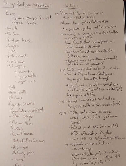
20 Brainstorm Ideas and 20 Reflective Objects
|
Colored Pencil Veggies
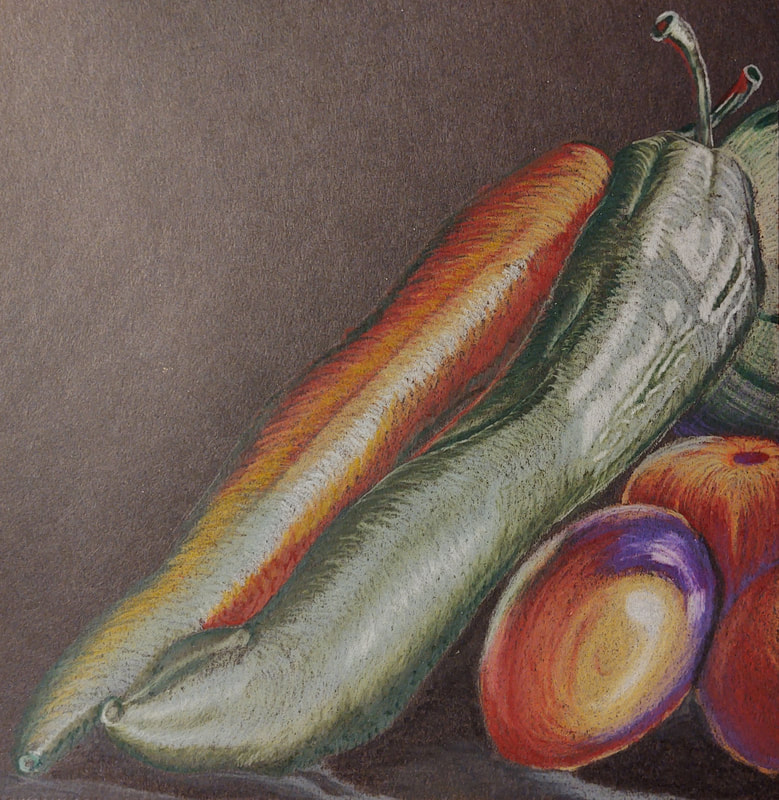
For this assignment, we were tasked with drawing either a fruit or a vegetable using colored pencils. Shown above, I drew a still life composing of two banana peppers, three cherry tomatoes, and a melon. A while back I had gone to the farmers market and had purchased the produce shown above. I thought it looked pretty cool so I decided to take some photos of it, which luckily came in handy for this assignment.
As far as technique and methodology, I made sure to take into consider the lighting situation in the photo. I made sure that neighboring vegetables reflected some light onto each other, and that they cast shadows onto each other. I intentionally left certain areas of the peppers rough to indicate the wrinkles in the fruit that are more clear in the reference photo below.
I feel like the weakest part of the composition were the two, rightmost tomatoes, and the melon. I wasn't able to get as much depth on them as I would like, and the melon looks a bit on the small side.
I'm really happy with how the green pepper came out, especially the texture I was able to achieve on the top portion especially.
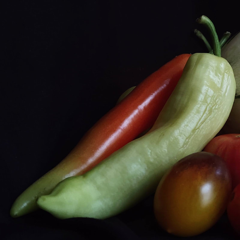
Reference Photo
Colored Pencil Forms
|
|
|
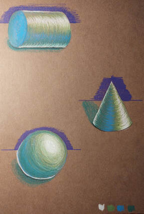
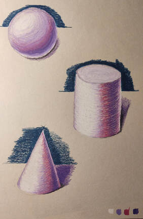
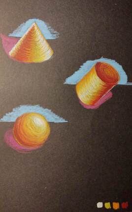
For this assignment, I was to draw a cone, cylinder, and sphere on three kinds of paper using three colored pencils, and a white colored pencil.
I feel like the middle one (grey paper) was the one that I did the best on, mainly due to the fact that I drew them the largest and that I spend the most time on them. I feel like they have the best depth and contrast as well as being the smoothest looking.
I feel like the middle one (grey paper) was the one that I did the best on, mainly due to the fact that I drew them the largest and that I spend the most time on them. I feel like they have the best depth and contrast as well as being the smoothest looking.
Colored Pencil Value Charts
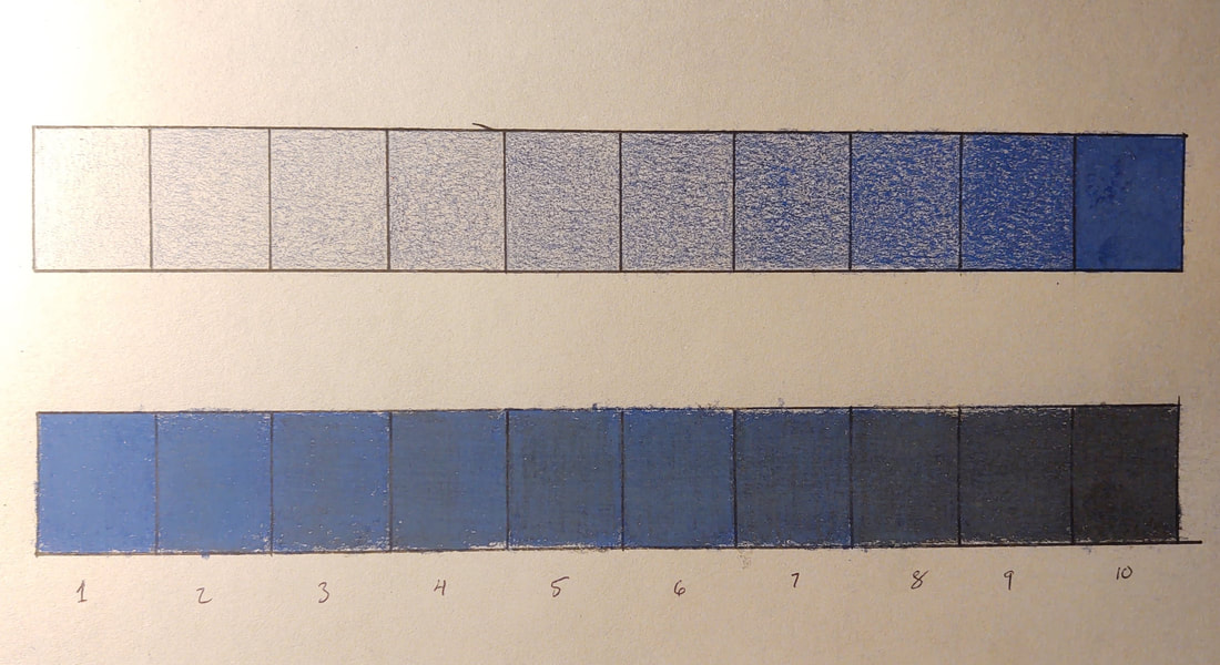
For this assignment I was to do two value charts using colored pencil. On top are shades, and tints are on the bottom.
The shades were pretty easy to do; so long as I took my time, did light layers, and prevented streaking, then they came out smooth.
The tints however were a lot harder. The biggest mistake I made was with the color I used. Tints would have been a lot easier to show if I had used a lighter color than blue. I feel like the resulting squares came out somewhat streaky and I didn't have a very smooth scale. 1-3 and 8-10 all came out approximately where I wanted them to in terms of tint, however squares 4-7 run together white a bit.
