Questions
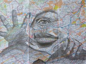
Illustration Friday
|
Watercolor
|
Mixed Media
|
Do over:
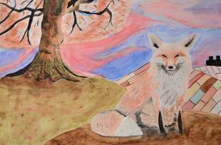
If I were given the opportunity to redo a project, I would choose to redo my watercolor piece. I made several mistakes while making this project. My main issue with the piece is that I messed up on the tree. I think that the trunk of the tree was very successful, though I believe that the leaves fell short. My mistake was that i painted the dark trunk before the brighter leaves, hindering my ability to produce the lighter colors over the trunk. I think that area turned out artificial and had a hefty copy paste look. The second thing I would change, or in this case prevent, is the overworking of the paper in the sky region. I simply added too much water to the paper and painted a little too hard and the paper started to pill up. Lastly I would add some more shading to the fox, it had decent texture, but I feel like some of the shadows fell short.
Most successful:
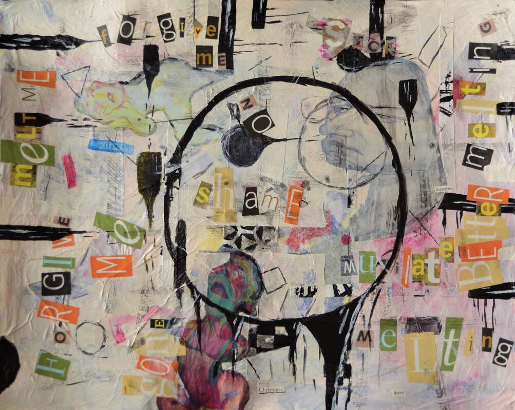
I feel like the multimedia project was my most successful piece in the year. I think because I didn't really involve any technical skills, that I could focus on my creative side more. I also had a lot of fun in making this piece, and when I’m having fun I produce more quality work.
With this project I wanted to convey some more negative topics such as those of discontempt and monotony, and I think I was successful in creating those emotions. I used words, facial expressions, shape, and color to portray my theme.
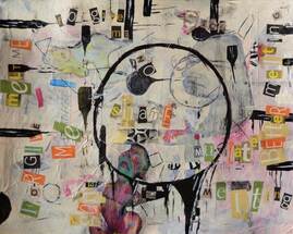
For this project I used many layers, giving the piece depth without 3D forms. My first layer was a layer of colored tissue paper. I chose blue, red, yellow, and some green and purple tissue paper. I then put down a layer of white tissue paper to make the colored tissue paper not as intense. I then put down several pieces of scrap test print paper, which I later found out, added some cool textures even when I covered it up. Next I put down some tape, and put on a thin coat of acrylic paint. The acrylic let some of the color through, which was my goal, and the taped areas has some nice contrast. Next I painted some shapes with black acrylic paint, and some black bars coming out of the sides as if they were “melting”. Next I found some pictures in some magazines that I thought fit the theme quite well, and used the gel medium to paste them down. I gave them a wash with some black and white acrylic paint. Next I cut out letters from a variety of magazines and used them to spell words such as “melting”, “stop”, “forgive me”, and “shame” among a few others. I then put a layer of gel medium over top the magazine pieces. I then added in a few more shapes and streaks of paint to help make the lettering blend in. Finally added in a big circle, what was melting, right in the center of the piece, with the intent of representing monotony.
Illustration Friday
I feel like illustration Friday was pretty good weekly practice in my art skills. I feel like it gave me a break, even though it was homework, from the current project in class. In the instances that I had a lot of time to work on it, and actually have fun producing a quality product, it allowed me to explore my techniques a bit more, as well as my creative side. For example, for the theme of “map” I drew several human features (on a map) which allowed me to explore the human form a bit more which helped out on the portrait piece. Going back to the beginning of the class for the theme of “samurai” I did a pen and ink piece of a Japanese temple in front of a waterfall. Regardless if it turned out completely realistic, and though it was lacking depth, it introduced me a bit more to the pen and ink medium.
If I were given the opportunity to redo a project, I would choose to redo my watercolor piece. I made several mistakes while making this project. My main issue with the piece is that I messed up on the tree. I think that the trunk of the tree was very successful, though I believe that the leaves fell short. My mistake was that i painted the dark trunk before the brighter leaves, hindering my ability to produce the lighter colors over the trunk. I think that area turned out artificial and had a hefty copy paste look. The second thing I would change, or in this case prevent, is the overworking of the paper in the sky region. I simply added too much water to the paper and painted a little too hard and the paper started to pill up. Lastly I would add some more shading to the fox, it had decent texture, but I feel like some of the shadows fell short.
Most successful:
I feel like the multimedia project was my most successful piece in the year. I think because I didn't really involve any technical skills, that I could focus on my creative side more. I also had a lot of fun in making this piece, and when I’m having fun I produce more quality work.
With this project I wanted to convey some more negative topics such as those of discontempt and monotony, and I think I was successful in creating those emotions. I used words, facial expressions, shape, and color to portray my theme.
For this project I used many layers, giving the piece depth without 3D forms. My first layer was a layer of colored tissue paper. I chose blue, red, yellow, and some green and purple tissue paper. I then put down a layer of white tissue paper to make the colored tissue paper not as intense. I then put down several pieces of scrap test print paper, which I later found out, added some cool textures even when I covered it up. Next I put down some tape, and put on a thin coat of acrylic paint. The acrylic let some of the color through, which was my goal, and the taped areas has some nice contrast. Next I painted some shapes with black acrylic paint, and some black bars coming out of the sides as if they were “melting”. Next I found some pictures in some magazines that I thought fit the theme quite well, and used the gel medium to paste them down. I gave them a wash with some black and white acrylic paint. Next I cut out letters from a variety of magazines and used them to spell words such as “melting”, “stop”, “forgive me”, and “shame” among a few others. I then put a layer of gel medium over top the magazine pieces. I then added in a few more shapes and streaks of paint to help make the lettering blend in. Finally added in a big circle, what was melting, right in the center of the piece, with the intent of representing monotony.
Illustration Friday
I feel like illustration Friday was pretty good weekly practice in my art skills. I feel like it gave me a break, even though it was homework, from the current project in class. In the instances that I had a lot of time to work on it, and actually have fun producing a quality product, it allowed me to explore my techniques a bit more, as well as my creative side. For example, for the theme of “map” I drew several human features (on a map) which allowed me to explore the human form a bit more which helped out on the portrait piece. Going back to the beginning of the class for the theme of “samurai” I did a pen and ink piece of a Japanese temple in front of a waterfall. Regardless if it turned out completely realistic, and though it was lacking depth, it introduced me a bit more to the pen and ink medium.
The Art Criticism Process
The Art Criticism Process:
The first stage of the art criticism process involves describing the artwork. In this step one disregards what they see subjectively in the artwork. One would only evaluate the work by its “facts” or what is actually in the piece.
The second stage in the art criticism process involves analyzing the artwork. In this step one would describe the relationships with what is seen. This is when one would start to incorporate the elements of art in their description. Rhythm and repetition, shape, texture, color, and emphasis among other topics may be discussed.
The third stage in the art criticism process involves interpreting the artwork. Figuring out what the artist meaning is, what emotions are they attempting to evoke are described in this step. Sometimes context is needed in interpreting the artwork, involving prior research to find out the artists situation and motives.
The fourth and final stage in the art criticism process involves judging the artwork. Based on steps one, two, and three, one may now judge the artwork. Elements that one likes, the effectiveness of the artwork in evoking an emotion, does one like the artwork, and what one feels when viewing the artwork are all discussed in the final stage.
For the critique I will be critiquing my mixed media project:
Describing- The piece contains many shapes, circles, rectangles, squares, triangles, of which some are outlined, and others are solid colors. Many of these shapes are repeated over and over such as the black rectangular shapes along the border of the piece. 3 figures are present; one is a light yellow with many intense curves. Another is white and bulky, with several large gradual curves. The final one is pink, again with some intense curves. Lettering is repeated over on the page drawing my eyes in up and down the page, side to side as well. A large black circular figure exists in the center of the piece, having several tapering limbs.
Analyzing- 3 human like figures are on the page, of which one is turned sideways. All 3 of them seem to have some sort of distorted quality to them, whether it is the elongation of the facial features or the accentuation of curves along the body. Many letters are used are clumped together to form words such as “melting” and “forgive me”, the font and position of the letters seem to be ecliptic in nature. Many of these words are negative in nature and have a negative connotation many rectangles exist along the border of the page which has the appearance of melting wax. A large black circle is in the center of the page, also appearing to be melting.
Interpretation- The piece exudes a very dark and moody tone. Negative feelings such as shame, discontent, and asking for forgiveness are all present. The facial expressions by the 3 humanoid figures are all of pain, and disappointment. The shapes that are melting all help to convey the melting theme, which ties into the mood of the piece.
Judging- I think the artwork was very effective in evoking the emotions that the artist intended. Themes such as disappointment, shame, and discontent are all touched on. The 3 figures faces all convey a very painful, disappointed expression. I would even call the background chaotic which also helps to convey the themes. I also think the rhythm of the shapes and figures draws my eye around the piece causing me to observe more effectively. I think the contrast with the black shapes and white background also help to guide my eye to the focal points of the piece
