Pop Art Clay Food
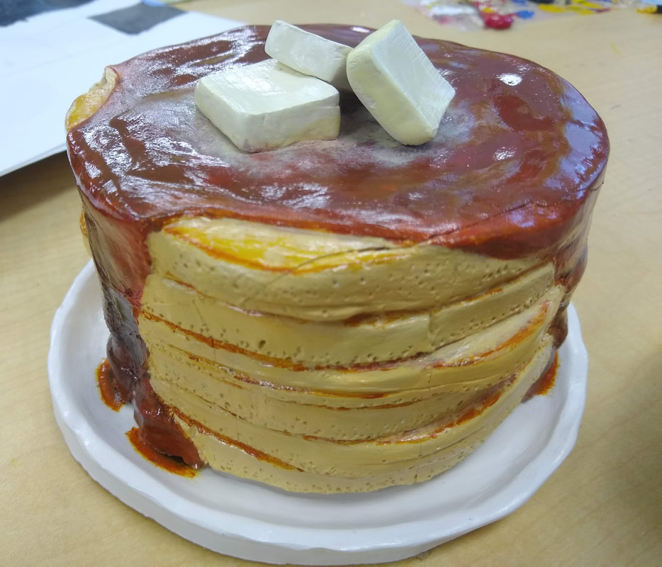
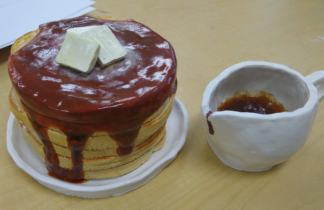
feel like my clay food was very well crafted. I feel like I got the irregular shape of the pancakes dead on. The texture of the syrup and pancakes were exaggerated enough so that it looks real. The plate was slapped together in half a class period and it shows. It could have looked much better on the wheel, but I didn’t have enough time for that. The syrup pitcher came out surprisingly smooth given the fact that it's a pinch pot; there is a nice curvature to the whole thing, and the handle adhered quite well despite the fact that it was far more moist then the body of the pitcher when I attached it.
Painting the pancakes was definitely the most difficult part of this project. Getting the right looking dark brown for the syrup was next to impossible, and I still feel like it turned out way too red. I'm happy with the lighter color of the pancakes, but not sure how I feel about the tops and bottoms (the darker parts) of the pancakes.
I feel like the colors work well with each other. I didn’t try to use complementary colors or anything, but I feel like the colors are quite accurate to real life, which was what I was going for.
My sculpture is definitely interesting from all angles. Each side of the pancakes presents a new syrup pattern, and different shapes of pancakes.
Finessing the clay tools in three dimensions is certainly more difficult then finessing a pencil along two. Despite it being more difficult, there was so much more that I could do with the extra dimension.
The syrup I left as smooth as I could, only differentiating it by raising it up from the pancakes themselves. On the sides of the pancakes, I poked small holes, which were meant to look like the air bubbles which form on the surface of real pancakes during the cooking process.
I think my project doesn’t look exactly like a real stack of pancakes due to the exaggerated texture, however, when looked at from a far, it looks quite good because of the texture. I also think the same principal applies to the color of the pancakes which I also exaggerated.
If I were able to do this project again, I’d budget my time more effectively so that I could create a better looking plate. I would also spend more time tapering off the edges of the pancakes since they do looks a little tall for what they are.
Notes: Another students art project exploded next to mine whilst it was in the process of being fired, and shattered my stack of pancakes into several chunks. The slabs of butter on the pancakes were also very easy to break off after they were fired, so those also had to be glued back into place.
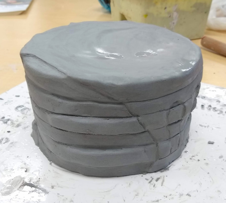
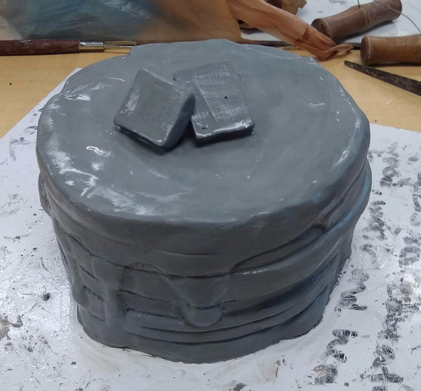
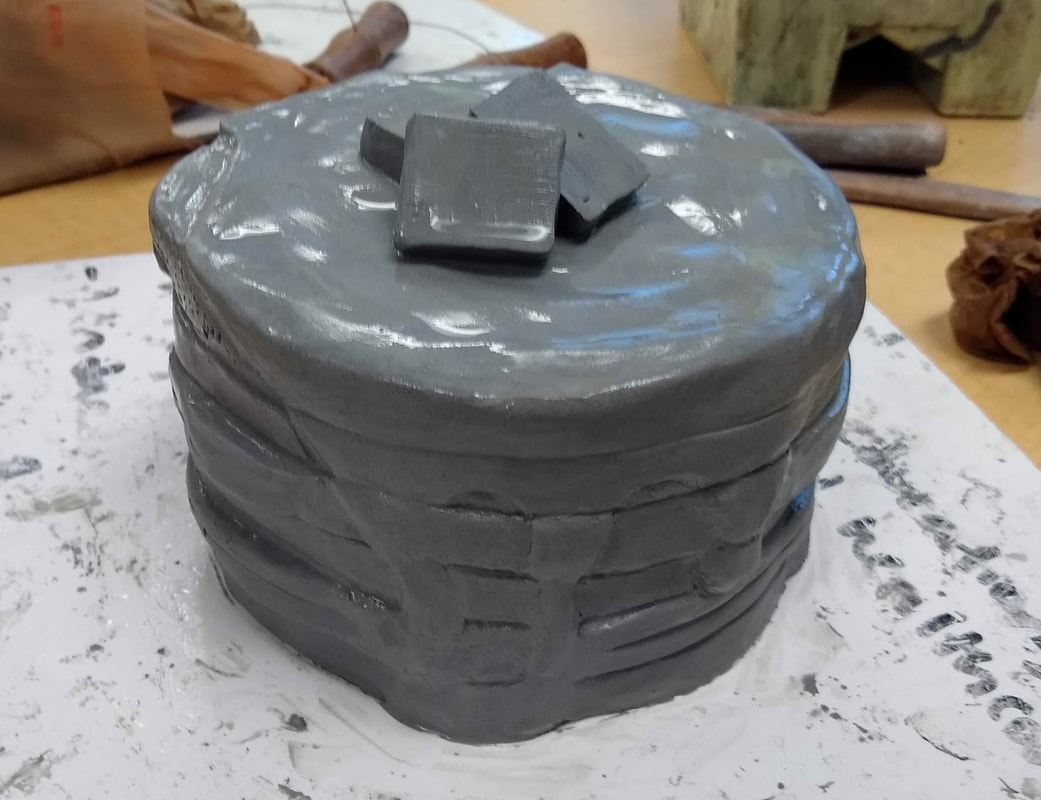
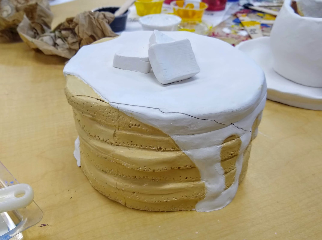
In Progress Photos
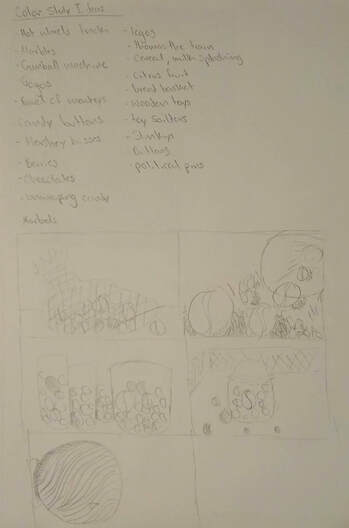
20 Ideas and Vocabulary
|
Colored Sketches
|
Print Making Project

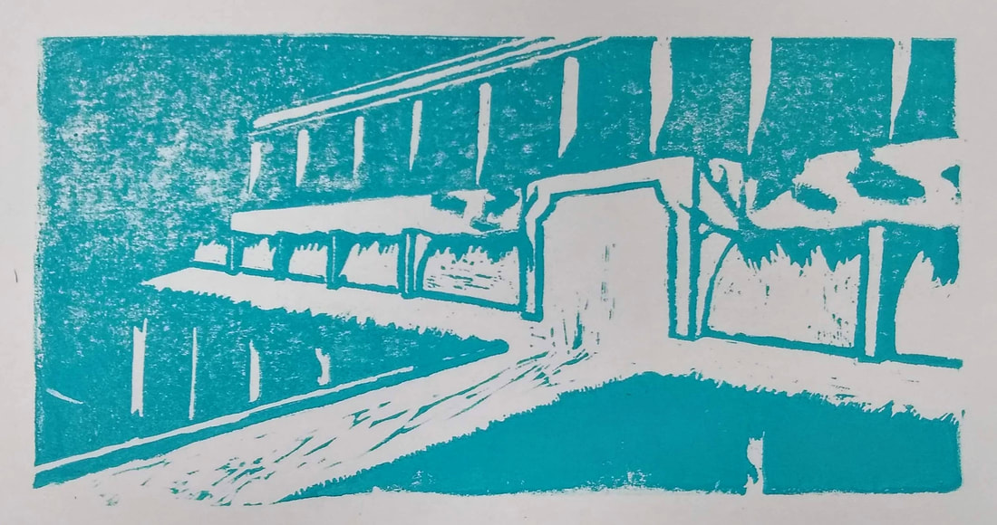
Final Print
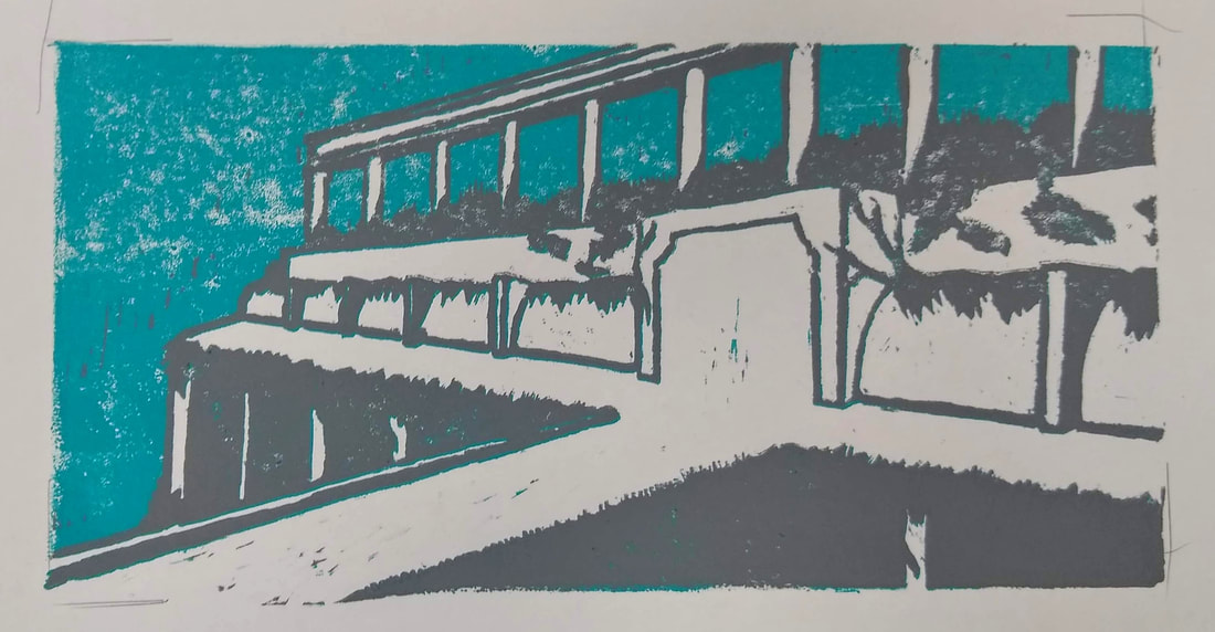
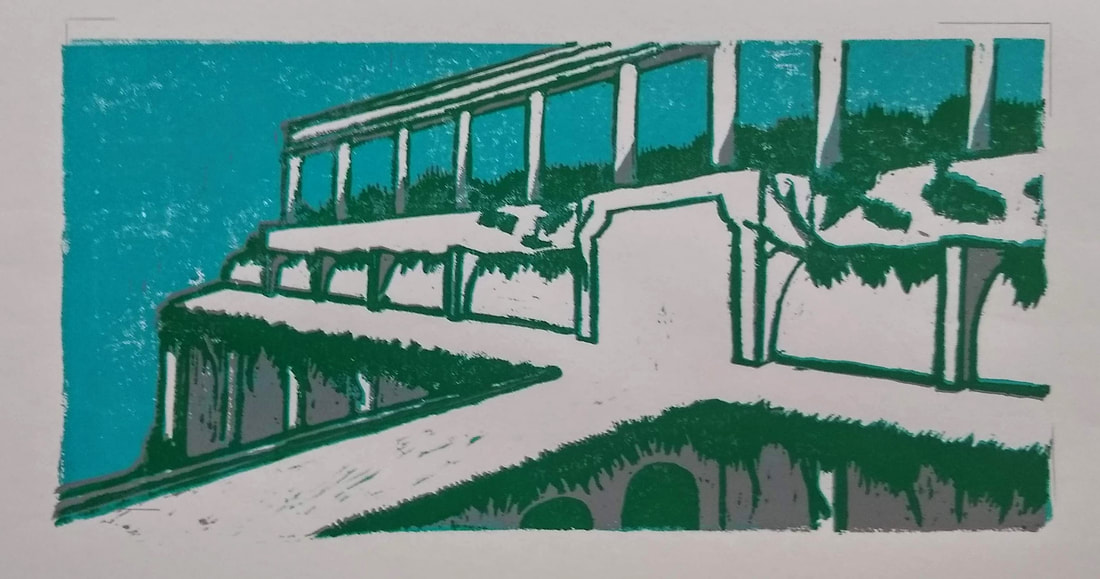
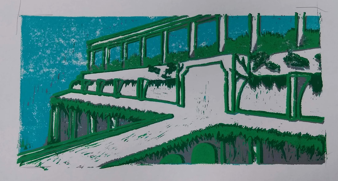
In Progress Prints
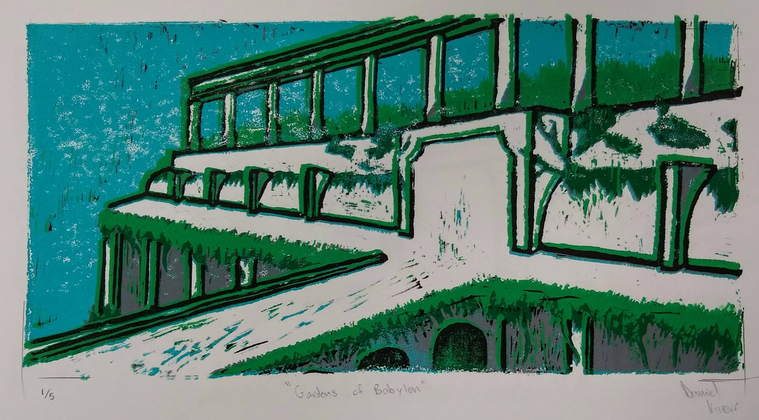
I feel like my print was well crafted. The way I cut my linoleum was very precise, although there were a few errors. The way I printed was also quite precise, however, even the slightest mistakes were exaggerated in the lines which outlined my structure. The lines caused it look like there were green, grey, and black lines next to each other instead of on top of each other.
I used texture to define my subject by using well defined, dark lines to outline my subject which made it stand out from the hairy looking plants which were draped over and around the building.
My color harmony could have used some work. The whole piece is very dark since I used grey, green, and blue as my main colors. I feel like my piece could have used some warmer colors such as yellow or orange.
The balance of my final print is off since I accidentally cut out the trees in the background before I printed with green ink. However, I feel like my final sketch had a much better balance then my best print did.
If I were to recreate my piece, I would do several things. First, I would clean up the lines which outline most of the structure of the garden. Secondly, I would mark the areas which I planned to cut away. Several times throughout the carving process I accidentally cut away parts of the linoleum which shouldn’t have been cut away (the trees behind the garden) and marking off the linoleum would prevent this. Lastly, I would also add some warmer colors to the project. A few extra prints that would add in a few red or orange flowers onto the vines and bushes would really give some balance to the piece.
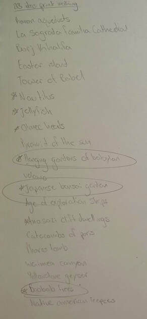
20 Brainstorming Ideas
|
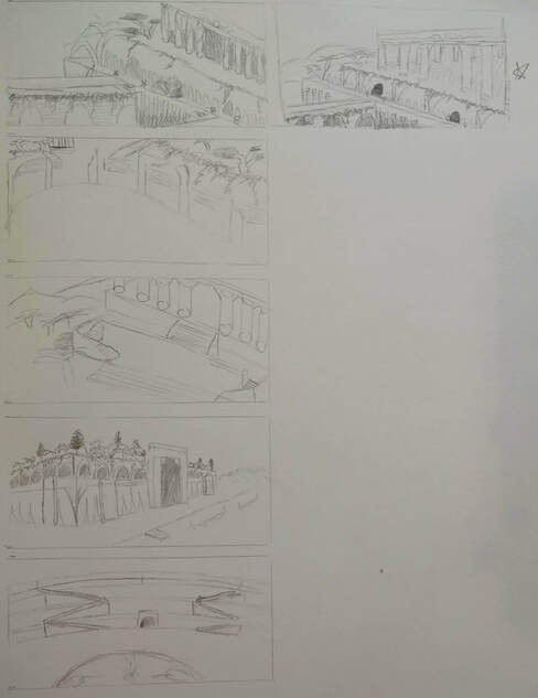
5 Compositional Sketches
|
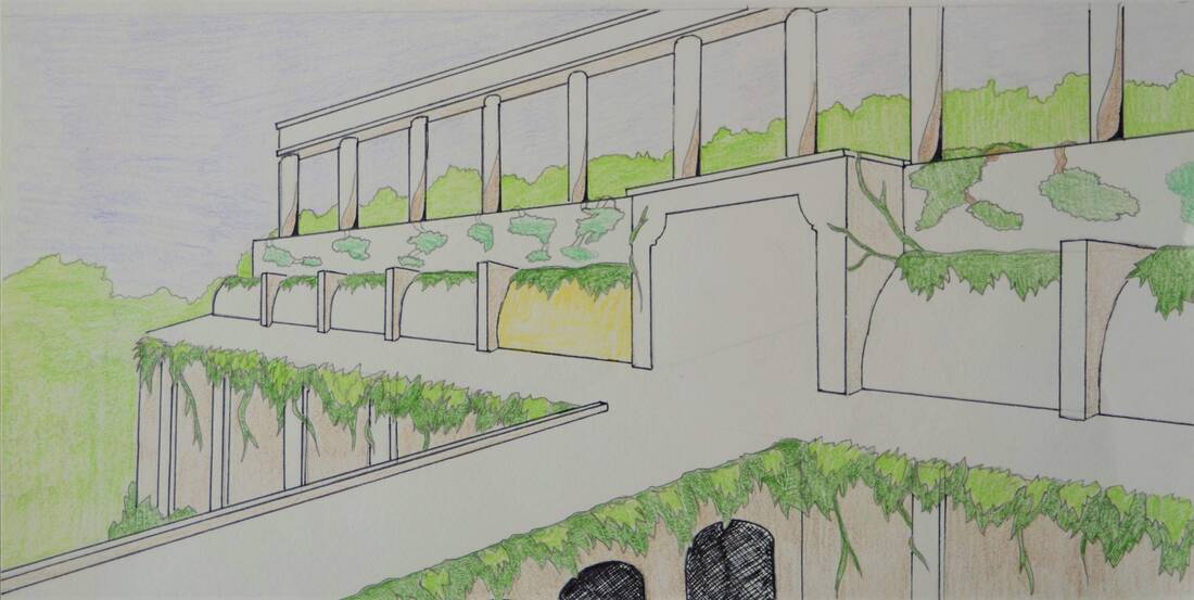
Final Colored Sketch
Chalk Pastel Final
Final Drawing
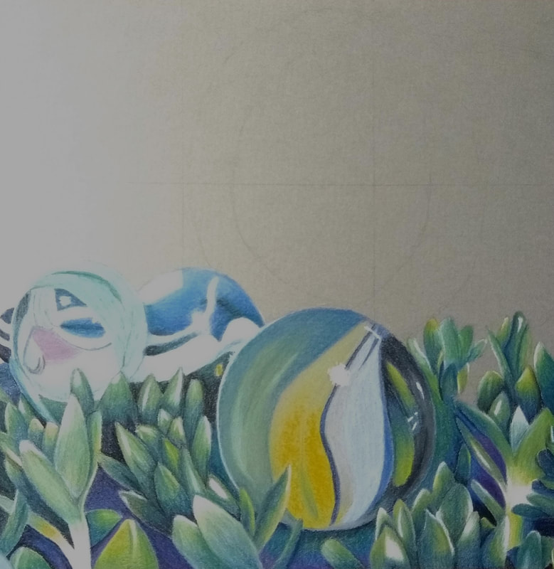
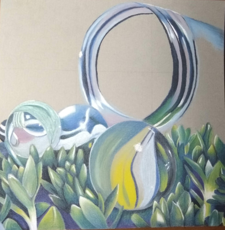
In progress photos.
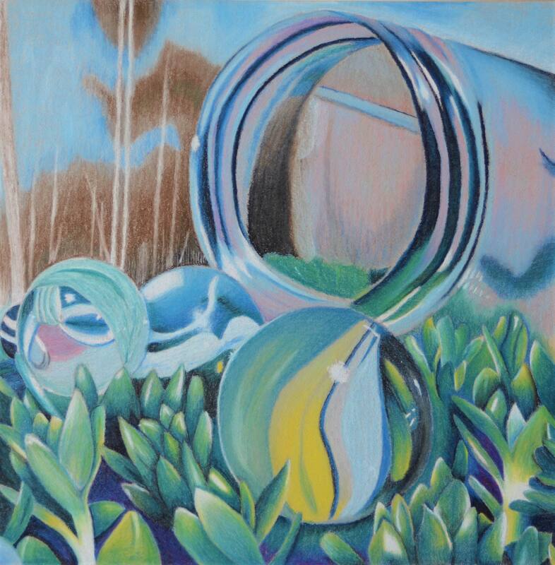
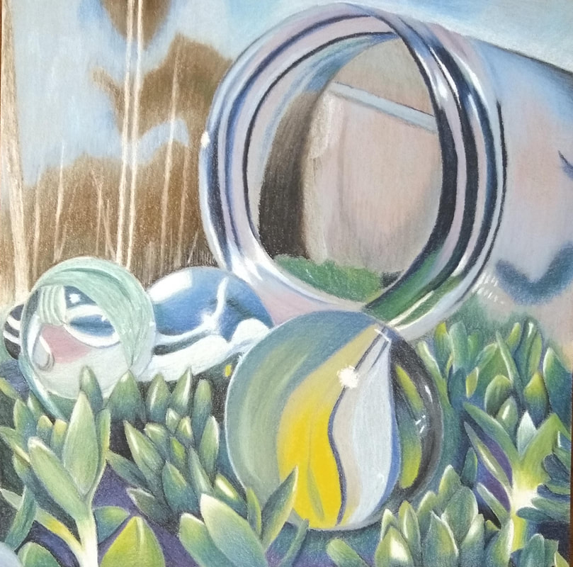
I feel like my overall composition worked out quite well, and created an interesting piece of art to look at. I cropped the reference photo so that the marbles and jar generally fell in line with the rule of thirds. The repeated shape (circle) that the marbles and jar had worked nicely to make the subject cohesive. The repeating plant texture also created a nice pattern which filled in the bottom half well without commanding too much attention. I also feel like my art guides the viewer’s eye from the jar to the left most marble, down to the rightmost; this makes it seem like the marbles are pouring out of jar.
I colored objects closer to the viewer darker than I did with the background. This created the illusion of depth since objects that are further away from the viewer generally appear lighter than ones that are closer. This is important since it makes the marbles really pop out and seem 3-D.
I used a lot of exaggerated color in this piece. Purple was especially helpful in the grass areas to give a good sense of contrast between the sharp edges of the plants and the ground. I used yellow and blue on the plants to shade light and dark areas respectively. Lastly I used lots of pink and brown in the glass jar which made it appear less flat. By using these exaggerated colors, I created a more convincing piece in terms of depth. If I were to attempt to color match what was exactly in the photo, the entire piece would look like they are in one single flat plain.
My craftsmanship was excellent in this piece. Every small detail, and color that was put into the picture was completely intentional. On top of this, this was the most tedious piece of artwork I have ever worked on. I used many light layers of chalk pastel so that I would be sure that everything was just the way that I wanted it to be.
I was able to achieve a good sense of depth in my composition by showing a foreground, middleground, and background. The plants which border the bottom half of my piece are the foreground which don’t distract the viewer from the subject of my piece, but it does fill the space well. The middle ground of my piece is the marbles and glass jar. The background of my piece are the trees which I drew intentionally blurry since I didn’t want them to distract the viewer from the subject.
The most difficult thing that I encountered while working with chalk pastel was the fear of smudging my composition. I often felt like I didn't finesse the pencil the way I wanted to just so that my hand wouldn’t rub against an existing layer of chalk.
Although chalk pastel can be tricky to work with, and easy to over-blend, it has several benefits. The color that chalk pastels produce are more vivid than watercolor pencils and colored pencils (which cause the paper to shine). Chalk pastels are also much easier to blend then any of the before mentioned mediums; I saw many students using q-tips or fingers to blend the chalk, however, in my experience, I found that the pencil alone was sufficient enough to blend the chalk.
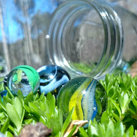
Reference Photo
|
20 Ideas and Compositional Sketches
|
Color Medium Candy Drawing
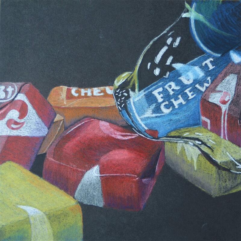
This was a practice drawing which helped me to better understand how to use colored pastels.
Color Mediums Practice
|
|
|
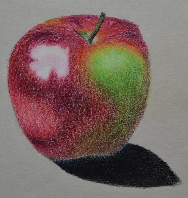
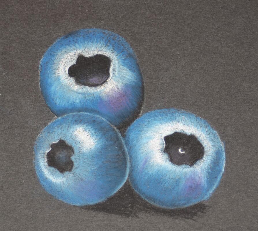
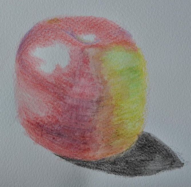
I was tasked with creating three practice pieces, one with colored pencil, one with chalk pastel, and one with watercolor pencils. I feel like the colored pencil apple and chalk pastel blueberries came out quite realistic, however the watercolor pencil apple looks somewhat muddy and flat.
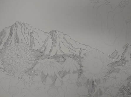
Pen and Ink Final
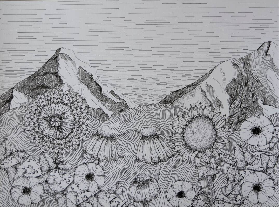
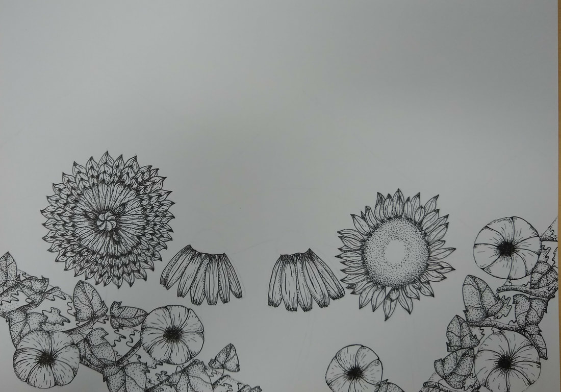
I arranged my composition in such a way that guides the readers eyes around the piece in a spiral. First they start at either mountain, then the hash marks in the sky move the viewers gaze to the other mountain, then down the trunks of the trees and across the flowers to the bottom of the piece.
Texture and patterns are especially important in my piece. In the instance of the mountains, they suggest the flow of the landscape. They wrap around the contours of the mountain and create convincing shapes. The pattern that I used in the sky helps to guide the viewer's eyes from one side to the other, which creates a more interesting composition.
Value is an important part of my piece. In the flowers, cast shadows create depth among the pedals. In the mountains, shadows help to show contours in the landscape.
I feel like my piece was crafted extremely well. I meticulously laid out each of the individual lines in the mountains and hills. I also feel like most of my flowers had realistic textures and good depth. While I was drawing my piece, I was aware of not only how my pen was moving, but also how much pressure I was applying to the pen.
Creating the practice studies really helped my final piece look as good as it does. With my practice studies I figured out how to create convincing shadows with stippling which is what I used to give my flowers their depth. The pattern practice sheets that I completed also gave me ideas for the textures of the wood and mountains.
It was especially important that I paid attention to the demos in class, since I grew my ability to create convincing shadows and realistic textures.
During this project I learned how to create an interesting composition which will carry over into future projects. I also expanded upon my ability to understand how light behaves with certain objects, and how it illuminates certain areas of my piece.
If I was to recreate my piece I wouldn't do many things different. The most glaring issue with my piece is the very flat looking flower on the far left. I feel like it lacks much depth, and its facing the viewer directly which doesn’t make for a very interesting looking flower. I would also tighten up the lines on the hills since they look somewhat messy.
Reference Photos
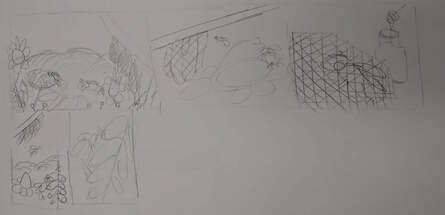
Compositional Skeches
Final Sketch
|
20 Brainstorming Ideas
|
Pen and Ink Practice
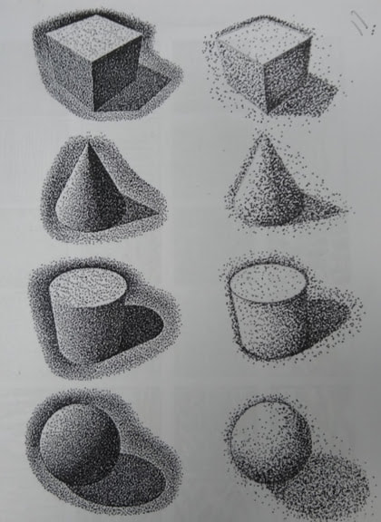
For this activity, we practiced stippling on several three dimensional shapes as well as texture and line technique. I feel like my stippling can still improve, however I believe that I did well on the rest of the boxes.
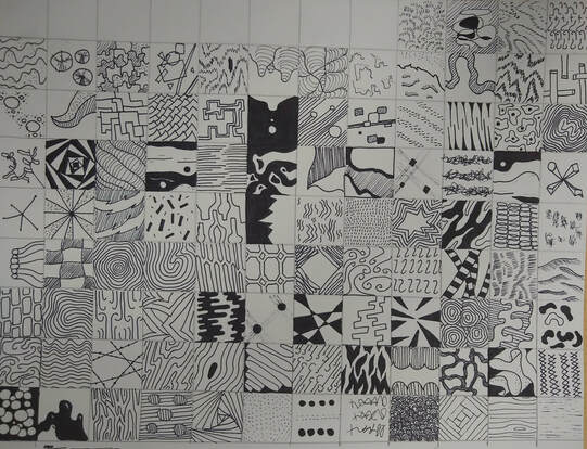
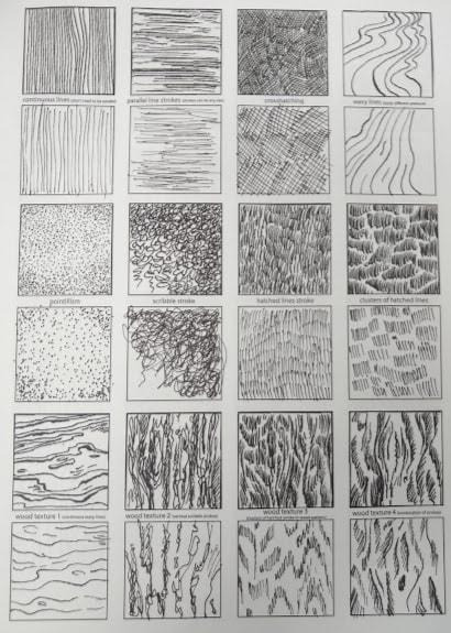
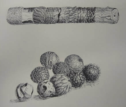
100 Inventive Textures
|
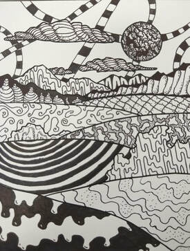
This was an exercise where we used our invented textures to fill in a landscape. I really like how the clouds and mountains turned out, however, I feel like I could have been neater on some of the hills.
|
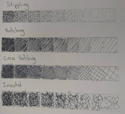
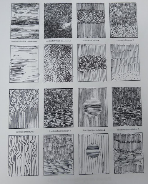
Hatching, cross hatching, stippling, and scribble value charts.
|
Tutorial Practice
|
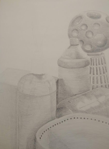
Pencil Still Life
Final Drawing
|
|
|
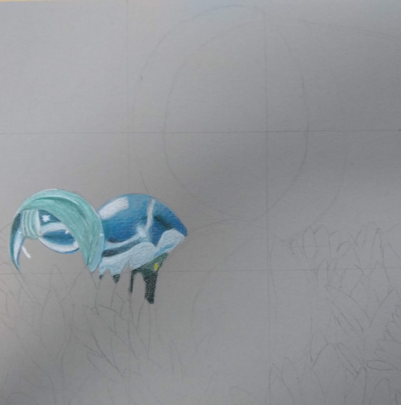
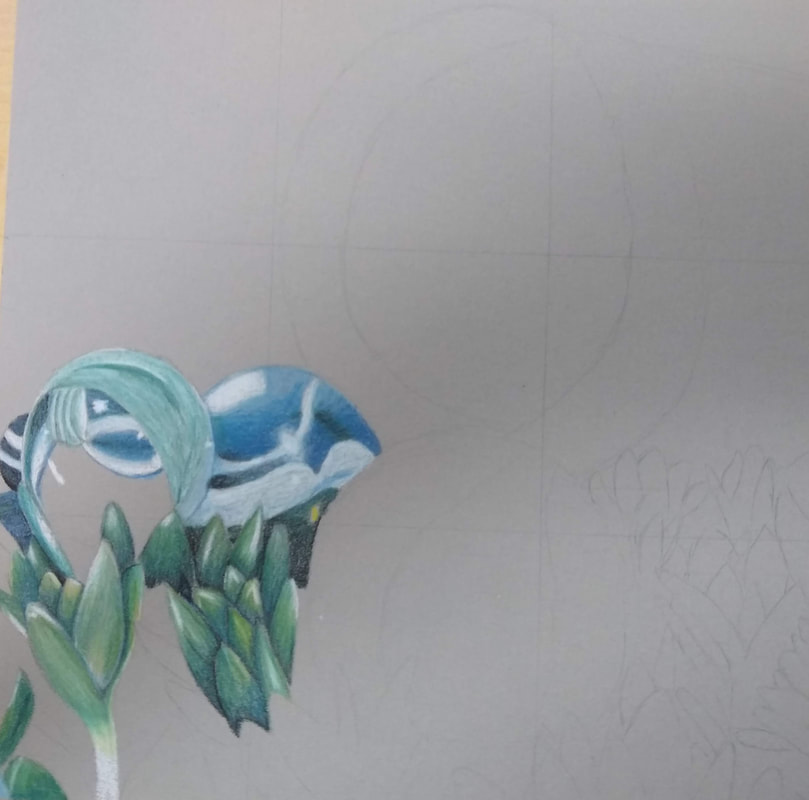
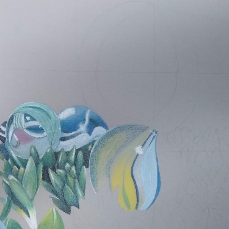
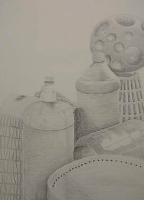
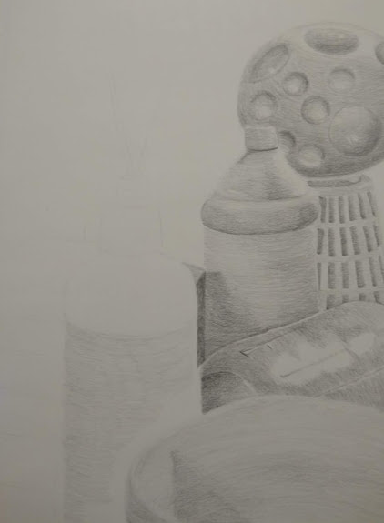
In Progress Photos
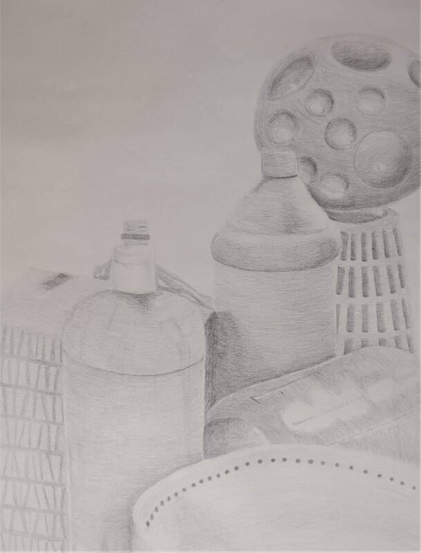
I arranged my composition in a manner that would fill the entire page and at the same time, not look cluttered. I incorporated objects of different shapes and sizes in the foreground and background. I feel like this was a very successful composition; the elements in the still life flow quite well and create an interesting piece.
I feel like I created a good range of values which is especially evident on the mason jar which has deep shadows and bright highlights.
My knowledge and practice on previous studies aided me with shading certain objects. Objects like the tissue box, had a lot of noise going on with its pattern, however, since I had practiced shading on a blank cube, my shading was much more successful.
I blended the transitions on my objects by doing several light coats of graphite, slowly pushing each coat back towards the darker side, to create a smooth and convincing gradient.
Capturing the texture of the object is critical in creating a convincing still life. Before I added texture to the objects, they looked flat and fake, however, after I added the texture, they looked very convincing.
If I had the opportunity to remake my piece, I would enhance the dark areas. Certain areas in my piece look somewhat flat due to the fact that they are too light. Some highlights also don't pop as much as they should due to the same issue.
Still Life Compositional Sketches
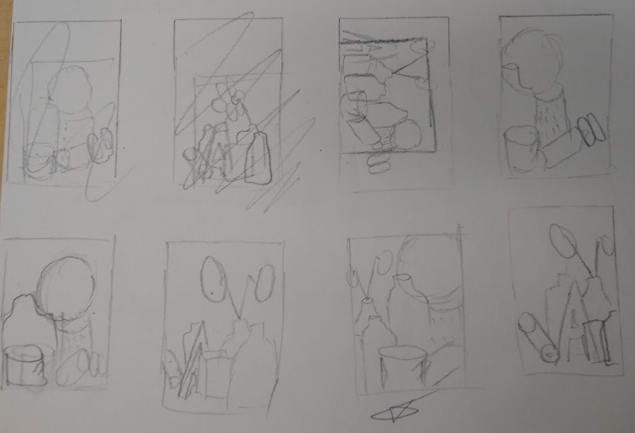
These are the compositional sketches for my still life. They help me place the objects in the scene before I do any of the final work. The one that is starred is the one that I chose to base my final piece off of.
