Personal Portrait
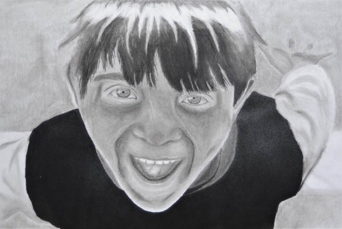
Final Drawing
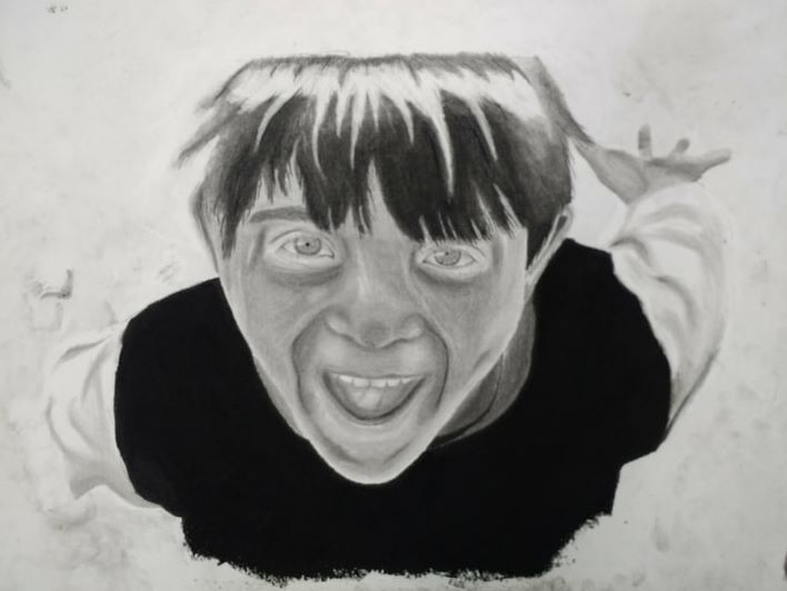
In Progress Photo
I did a graphite and charcoal portrait of my younger brother.
I started out by splitting the photo into 4, digitally, and printed out the 4 pictures to use as a template. I then used a piece of charcoal and put a moderate coating of it on the entire back of the pictures and taped them down on the drawing paper. Next I traced the picture with a blunt pencil as to not leave any indentations on the paper, which transferred the charcoal onto the paper. I then removed the pictures, leaving me with my outline. I started off by drawing the eyes, working my way outward to prevent smudging. I used a 4B pencil to do most of the light and mid tones, and a dark charcoal pencil to do the fine detail and darker tones. I then moved onto the nose and mouth area. His nose is quite small and flat in the picture so it was quite easy to shade properly. I then moved onto the mouth which was a bit more difficult. His lips were very thin, so there wasn't too much shading to do there. I then moved to the inside of the mouth which has some reflections on it making some nice contrast. I then moved on to the jaw area and smile lines. I first shaded in the general area where the lines would be and used a charcoal pencil to do the actual line. I then finished shading in the rest of the skin, perhaps overdoing the contrast as there wasn't much to begin with in the photo. I then moved onto the hair. First I shaded in the basic shapes in the hair, the large dark areas, and the larger lighter areas. I then divided the large sections into smaller locks of hair. I then blended the area between the light and the dark and added in the texture, breaking up the ends of the locks, and adding in stray lines throughout to give the illusion of a ton of individual hairs. Next I took a chunk of charcoal and shaded in the torso portion of the shirt to the point where it was black. Next I drew in the white portion of the shirt using a 2H pencil to add in the folds and shading. I felt like this part was quite successful, considering it was my first attempt at drawing textiles. I then drew in the visible hand, again overdoing the lights and darks. I then shaded in the sand, sea, and air in the background as solid colors as to not draw too much attention away from the focal point. Finally I cut the picture down to size and will eventually spray it with the fixitant.
I think the piece was incredibly successful considering it was my first portrait piece. I found the hair to be particularly realistic, as well as the eyes. I felt like the black shirt came out exactly as planned, with clean lines and a matte look. Perhaps the skin could have more texture even though the picture showed little to no texture anyway and I think the nose has either too much or too little contrast, depending on the area. I also feel like under the eyes may be a little to dark so I may go back in and lighten it up.

Reference Photo
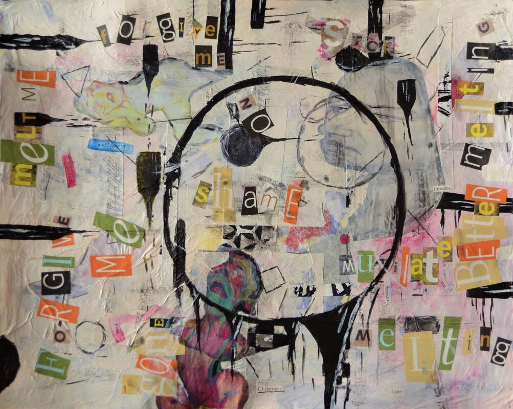
Mixed Media
Final Piece
Detail Shot
I first laid down a layer of tissue paper and gel medium. I went with a primary color palette, to give it some balance. I then put a layer of white tissue paper over that to blend some of the colors, and to make it more mellow. I then laid down several pieces of scrap print paper, fallowed by strips of tape proceeded by a thin layer of acrylic paint. Next I then lightly added in some shapes with black acrylic paint, along with some bars on the side that are *melting*. Next I cut out some images and words that fit my topic well and put them down in several layers. Next I washed the pictures with acrylic paint to make it blend in with the background. I then added in a few more shapes and touches around the words. Finally I painted the large melting circle in the center.
My topic was "life mantras such as "fallow your dreams" repeated over and over again in different fonts on the page". Now I liked this topic, but I also wanted to put a twist on to it. In the end I did fallow the topic but instead of more happy, upbeat life mantras, I did ones that fallowed a dis-contempt theme. I used the words to portray dis-contempt feelings in somewhat of an abstract way. Melting, I felt, was a pretty good word in the since that people can interpret it in different ways, other than what it means to me. Forgive me, I used to portray the mistakes that people make and the dwelling that happens on some of theses mistakes. I also added in a few random words such as "Christopher" and "resonates" as to give sort of a weird uncomfortable feeling (maybe). Obviously I made some of the shapes melt, tying in with the Melting phrase. I felt that the images that I included also portrayed somewhat of painful dis-contempt look. Lastly the large circle in the center, for me, portrays monotony and the dis-contempt feelings that comes with it.
My overall goal was to really make a piece that everyone can find their own meaning in with their own personal experiences.
Clay Slab Box
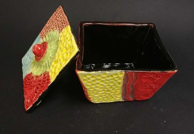
Final Box
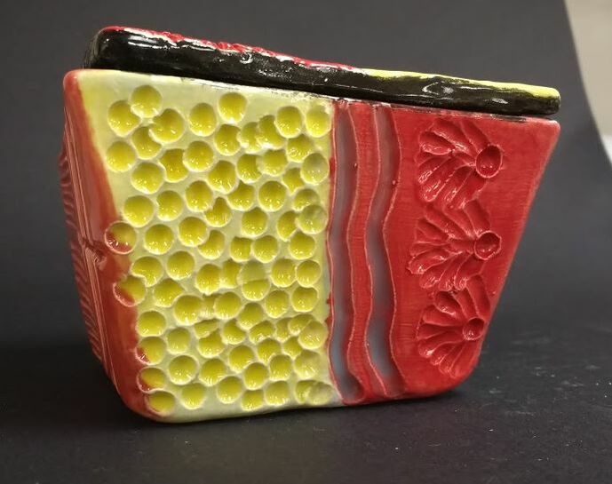
Detail Shot
In Progress:
I plan on glazing my piece after it is done firing. I also plan on using some more earthy colors perhaps to complement some of the shapes. Finally I plan on perhaps adding a better knob on the top.
I think most of the textures I have put on the box look good as well as the smooth edges and faces of the rest of the box.
I started by rolling out a slab of clay about a quarter inch thick. I then created some templates in the shapes I desired, to get the shape of box I wanted. Next I allowed the clay to dry out a bit to make it more sturdy and easy to handle. I then attached the 4 side pieces to the base, cutting the edges at a 45 degree angle to have a larger surface area to scratch and slip and to get a more even shape. I then assembled the lid, which didn't turn out the way I wanted leading me to the scrap the idea and go for a different design. Next I took a sponge and water and smoothed off the faces and edges of the box, as well as taking off small bits as I go to refine the shape. Next I started to put in textures into the sides. I didn’t have any central theme at this point so I continued kind of randomly. I then added in the textures to the lid as well as the knob and the feet. Finally I fired my peace bringing it to where I am now.
Finished Piece:
After I had finished the first fire all that was left was to glaze it. I ended up attaching a color to each texture. For example I gave the dots both on the lid and on the side the color yellow. I went over each coat of glaze several times to really give it a thick coat and deep color. Next I glazed the inside black to really make some the colors pop on the outside, fired it, and it was complete.
I think the colors were pretty good, as well as the textures.
If I were to do it again I would definitely be more careful about the shape of the box, as my final piece is kind of lopsided. I would also make the knob at the top larger because in its current state it is just too small and slippery to be useful.
Linoleum Printmaking
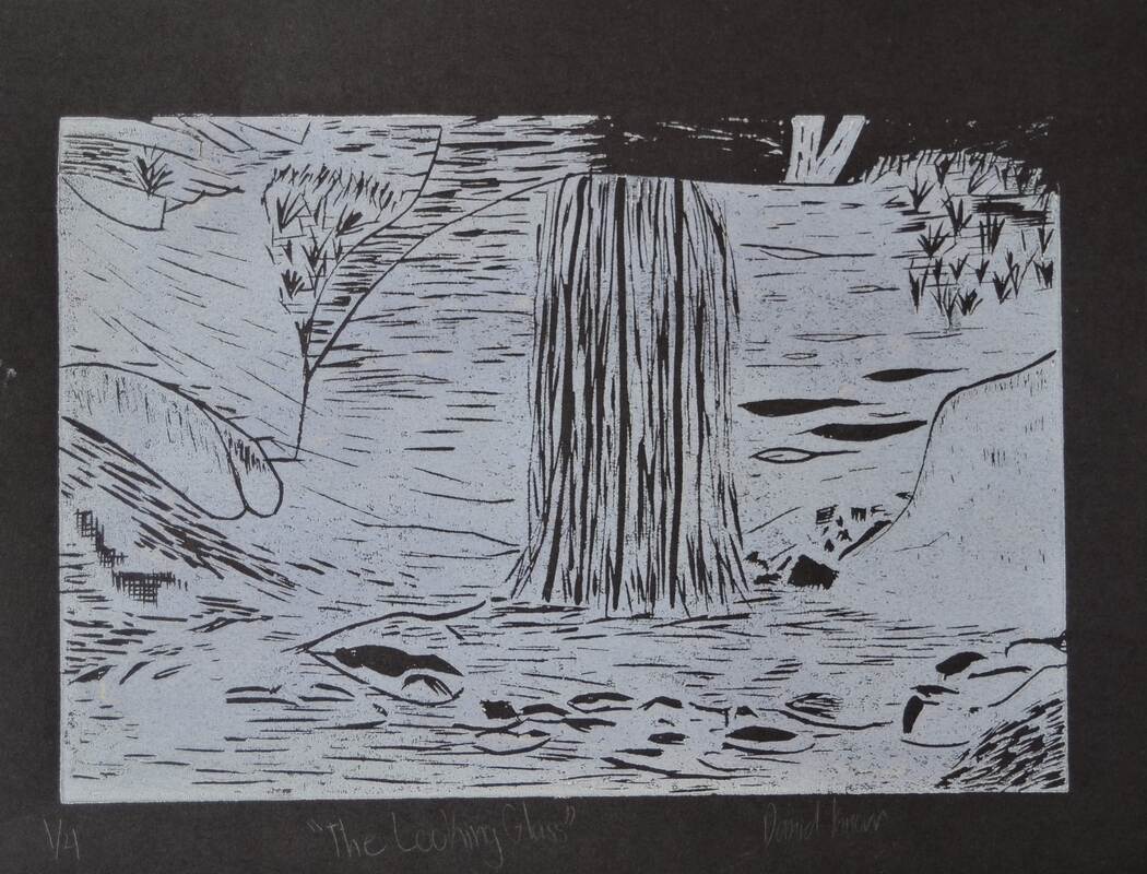
Final Print
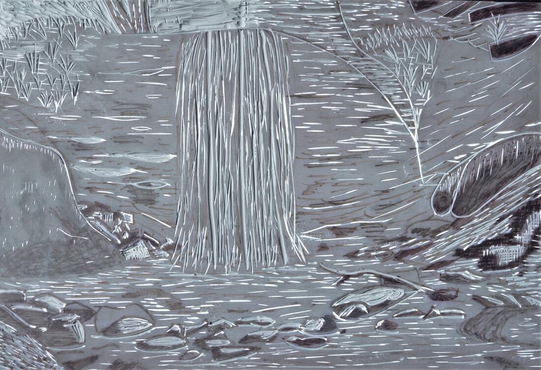
Linoleum Block
If I were to do this project again I would do several things differently. First I would go through with more detail, as some of the features are lacking. Secondly I feel that there isn't a whole lot of debt to the piece so I would definitely push some of the values more. And lastly I would give the piece more variety; some of the stones and plants blended together and it made the whole thing flat. If I had given more defining features then I could have potentially gotten the desired result.
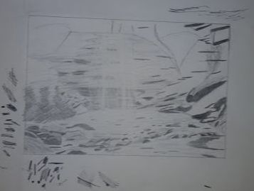
I used the theme of line in my print piece. I attempted to use some hatching techniques to simulate shadows. I also made the most defining features the ones with the most lines (the waterfall).
I used the theme of line in my print piece. I attempted to use some hatching techniques to simulate shadows. I also made the most defining features the ones with the most lines (the waterfall).
Final Sketch
Fictional Character Water Color
Final Painting
In Progress Photo
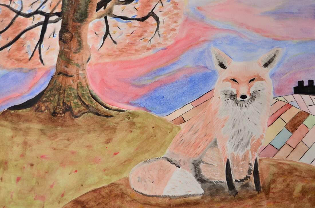
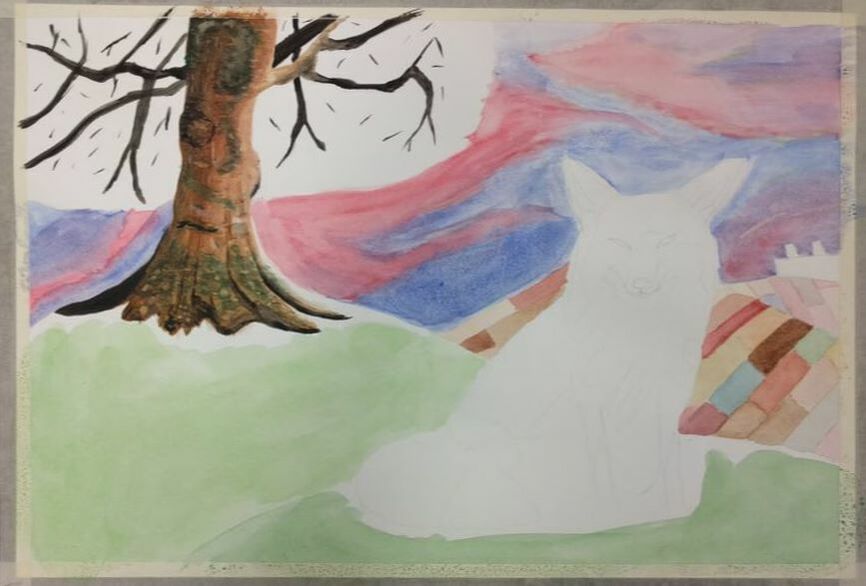
I recreated Fantastic Mr. Fox by Roald Dahl.
My design differs from the original one by Roald Dahl because I made my version less cartoony breaking from the suit and 2 legged design from the book.
First I started out with lightly sketching out the basic shape of my painting. The tree, farm, and character were all roughly put down. Next, I started working on the sky portion of the piece. I was going for more of a fall aesthetic in my piece so I used a lot more browns and reds then what would be normal, so in the sky, I gave it a tie-dye look by working in splotches of red as well as dark blue to give the red some contrast. I then lightly painted in the 2 hills that the tree and fox were situated upon. Next, I painted in the fields around the farm. Sticking with the theme, I painted mainly shades of brown, orange, and red. I then started working in the basic shading of the tree. I roughly put where the sun was shining and where there were shadows cast upon the trunk of the tree. I then worked in some greens and whites and added some black details. I then started work on the fox, using very light strokes with a fine brush using browns oranges and blacks. I then added in the leaves on the tree (this is where I messed up) realizing that I couldn't paint over the black branches with the orange and red leaves. I then added in the black features on the fox and the black farmhouse in the background.
To someone working in watercolor, I would definitely remind them to never forget to paint from lights to darks regardless of what part of the painting it is. In my case, I painted the leaves after I painted the branches inhibiting me from making any of the leaves in front of the branches. I would also suggest to let the colors dry before painting something near that section. Color bleeding wasn't a major problem for me but it definitely happened, and it’s quite annoying to undo.
Most Helpfull Warmup
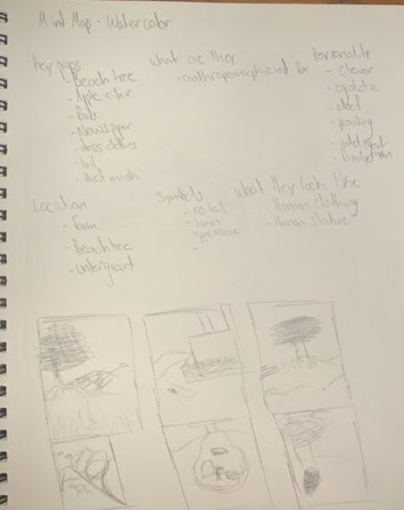
Brainstorming Ideas
The Idea of a Place
Final Painting
In Progress Photo
Detail Shot
The most helpful warm up was the hue value scale, it gave me some practice with gradients that I then applied in my painting.
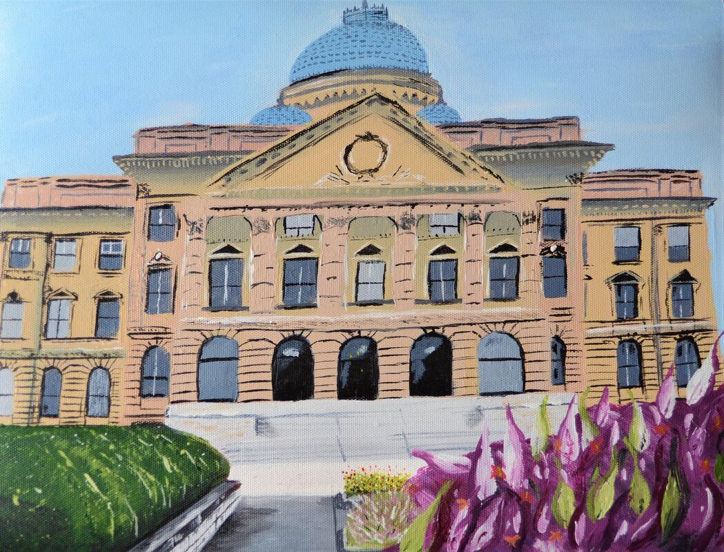
The place that is represented in my painting is Wilkes-Barre Pennsylvania. This place is important to me because both of my parents grew up here, and I have a ton of family that lives here, so naturally, we would visit this place a lot. The area that they grew up in has so much beauty, despite it being so run down. The area has a lot of natural beauty boulder fields, deep pools of water, waterfalls and wonderful plant life can be found here. Formally being a coal mining town they have many historical sites and old factories, Eckley’s miner village, Old wood and iron structures and stone buildings included. It’s just a really fun change in environment whenever we go up there, a big change from the modern up kept Apex area.
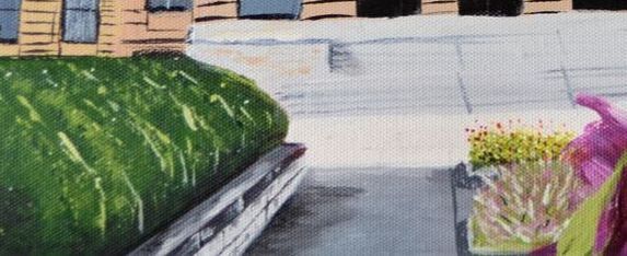
The most challenging thing to paint was the building. Getting every detail was nearly impossible, and in some places, I had to imply the detail rather than actually painting it. The bases of the pillars and the lines between each brick were too intricate to paint, so I had to imply its detail.
I felt like I was most successful with the natural elements of the painting. I feel like the bushes look really realistic and have great shading. The flowers, I think, we're spot on, and when it came to the canna lilies I had to somewhat stylize it but I think they turned out pretty good.
My Process:
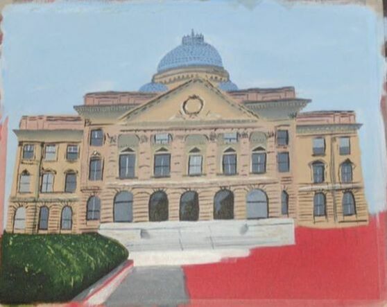
I first sketched out roughly where each shape would be. The shape of the building, the plants and roof were all marked beforehand. I then painted in the sky, adding in small drops of white paint and mixing it in to produce light clouds. I then painted the building in as one solid color, no shadows. After that, I played around with the windows for a while. I attempted to paint the windows after the base coat of the building, before the building base coat, with and without tape; nothing seemed to quite look right. Several attempts later I settled on an imperfect freehand style. This was definitely the most frustrating part of the whole painting. I then added in all of the detail on the dome part of the painting. Next, I put in some detail into the windows. I then worked in some gradients behind the pillars, and under the ledges. I then added some fine detail around the windows and ledges. I put in the front entrance, pillars, and stairs and finally, I added in the sidewalks bushes, flowers, and touched up the entrance.
During the process I had to exaggerate some of the shadings to make it pop a bit more, the darker tones of the color of the building didn’t cut it so I ended up using a lot of straight up black and white for this. I also had a hard time mixing the pain, when I would run out of a color and attempt to mix the same color, it almost never turned out the same, and occasionally I would under mix it causing streaks of blue or red on my canvas.
The place that is represented in my painting is Wilkes-Barre Pennsylvania. This place is important to me because both of my parents grew up here, and I have a ton of family that lives here, so naturally, we would visit this place a lot. The area that they grew up in has so much beauty, despite it being so run down. The area has a lot of natural beauty boulder fields, deep pools of water, waterfalls and wonderful plant life can be found here. Formally being a coal mining town they have many historical sites and old factories, Eckley’s miner village, Old wood and iron structures and stone buildings included. It’s just a really fun change in environment whenever we go up there, a big change from the modern up kept Apex area.
The most challenging thing to paint was the building. Getting every detail was nearly impossible, and in some places, I had to imply the detail rather than actually painting it. The bases of the pillars and the lines between each brick were too intricate to paint, so I had to imply its detail.
I felt like I was most successful with the natural elements of the painting. I feel like the bushes look really realistic and have great shading. The flowers, I think, we're spot on, and when it came to the canna lilies I had to somewhat stylize it but I think they turned out pretty good.
My Process:
I first sketched out roughly where each shape would be. The shape of the building, the plants and roof were all marked beforehand. I then painted in the sky, adding in small drops of white paint and mixing it in to produce light clouds. I then painted the building in as one solid color, no shadows. After that, I played around with the windows for a while. I attempted to paint the windows after the base coat of the building, before the building base coat, with and without tape; nothing seemed to quite look right. Several attempts later I settled on an imperfect freehand style. This was definitely the most frustrating part of the whole painting. I then added in all of the detail on the dome part of the painting. Next, I put in some detail into the windows. I then worked in some gradients behind the pillars, and under the ledges. I then added some fine detail around the windows and ledges. I put in the front entrance, pillars, and stairs and finally, I added in the sidewalks bushes, flowers, and touched up the entrance.
During the process I had to exaggerate some of the shadings to make it pop a bit more, the darker tones of the color of the building didn’t cut it so I ended up using a lot of straight up black and white for this. I also had a hard time mixing the pain, when I would run out of a color and attempt to mix the same color, it almost never turned out the same, and occasionally I would under mix it causing streaks of blue or red on my canvas.
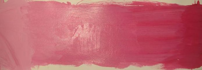
Acrylic Paint Value Scale
Two in One
Final Drawing
In Progress and Detail Shot
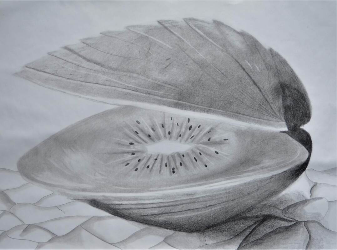
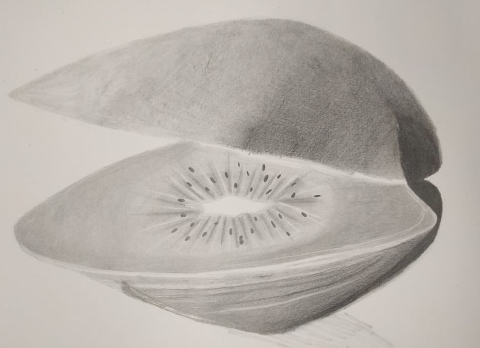
I chose to use pencils to create my 2 in one project. I chose this medium because pencils allow me to have a wide array of shades in my final piece. I was able to easily get black blacks, bright whites and everything in between. Pencils also allow me to blend the shades really easily, allowing me to get a clean gradient effect.
I added together a clam and a kiwi
I started by lightly sketching out the basic shape of the clam and roughly where the kiwi would be situated. Next, I shaded the bottom of the clam in the appropriate locations and smoothed everything out. Once I had a suitable gradient I then drew in the kiwi. I actually finished the kiwi first, thinking that it would be easier to work my way from the inside out. I used an eraser to add in white spots simulating light reflecting off the surface of the wet kiwi. I then shaded in the gradient on the top of the clam, roughly marking where the dark and light lines would end up. Next, I added in the details on the bottom of the clam, the dark lines, the light lines, and the imperfections. I then added some fine detail at the top of the clam. I then erased portions off the top of the clam to give it a rigid look. At this point, all I had left to do was add in a background.
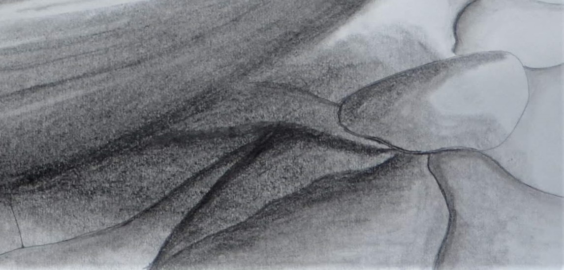
I finished by adding in the sand. This ended up being the hardest part of the whole project. It took several attempts in my sketchbook before I found the texture I was looking for.
I added together a clam and a kiwi
I started by lightly sketching out the basic shape of the clam and roughly where the kiwi would be situated. Next, I shaded the bottom of the clam in the appropriate locations and smoothed everything out. Once I had a suitable gradient I then drew in the kiwi. I actually finished the kiwi first, thinking that it would be easier to work my way from the inside out. I used an eraser to add in white spots simulating light reflecting off the surface of the wet kiwi. I then shaded in the gradient on the top of the clam, roughly marking where the dark and light lines would end up. Next, I added in the details on the bottom of the clam, the dark lines, the light lines, and the imperfections. I then added some fine detail at the top of the clam. I then erased portions off the top of the clam to give it a rigid look. At this point, all I had left to do was add in a background.
I finished by adding in the sand. This ended up being the hardest part of the whole project. It took several attempts in my sketchbook before I found the texture I was looking for.
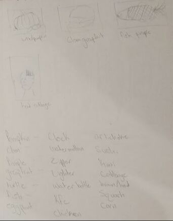
Brainstorming Ideas
