January 22nd 2020
|
|
|
|
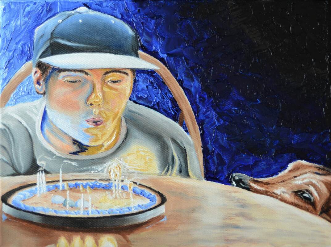
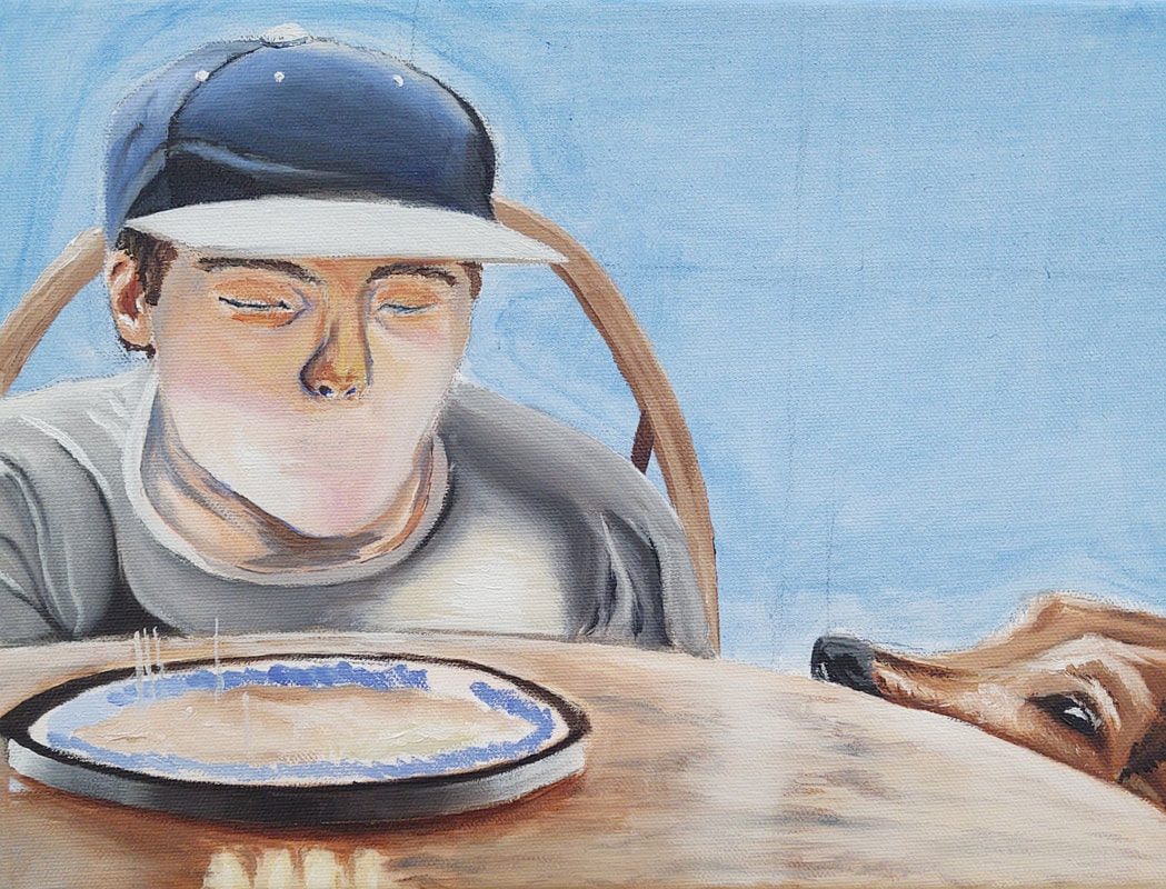
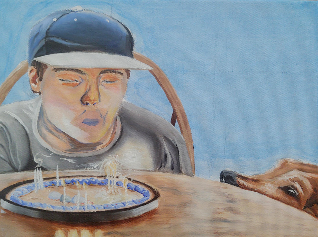
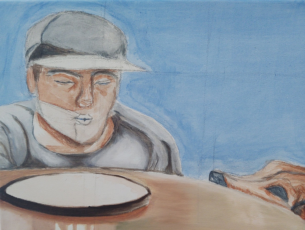
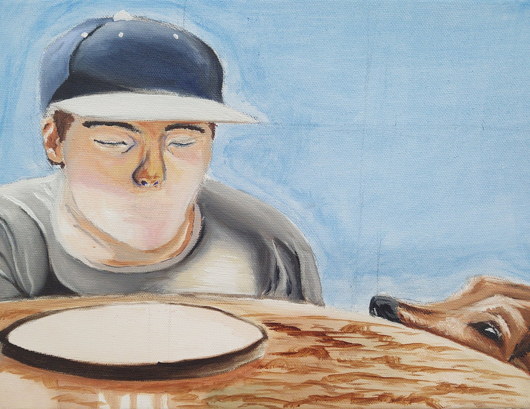
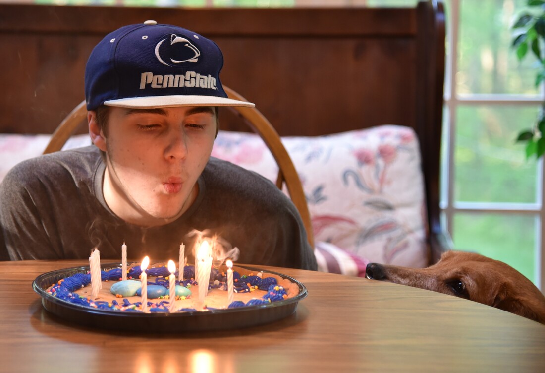
For one last brief project in Art 3, I decided to pursue a portrait done in Oil paint. Picking the image wasn't too tricky, I had quite a few that I liked but I felt like this one had the best composition, and had the easiest lighting situation to paint. I also felt like I could add in my own artistic styles pretty well to this reference photo which is another reason why I chose it.
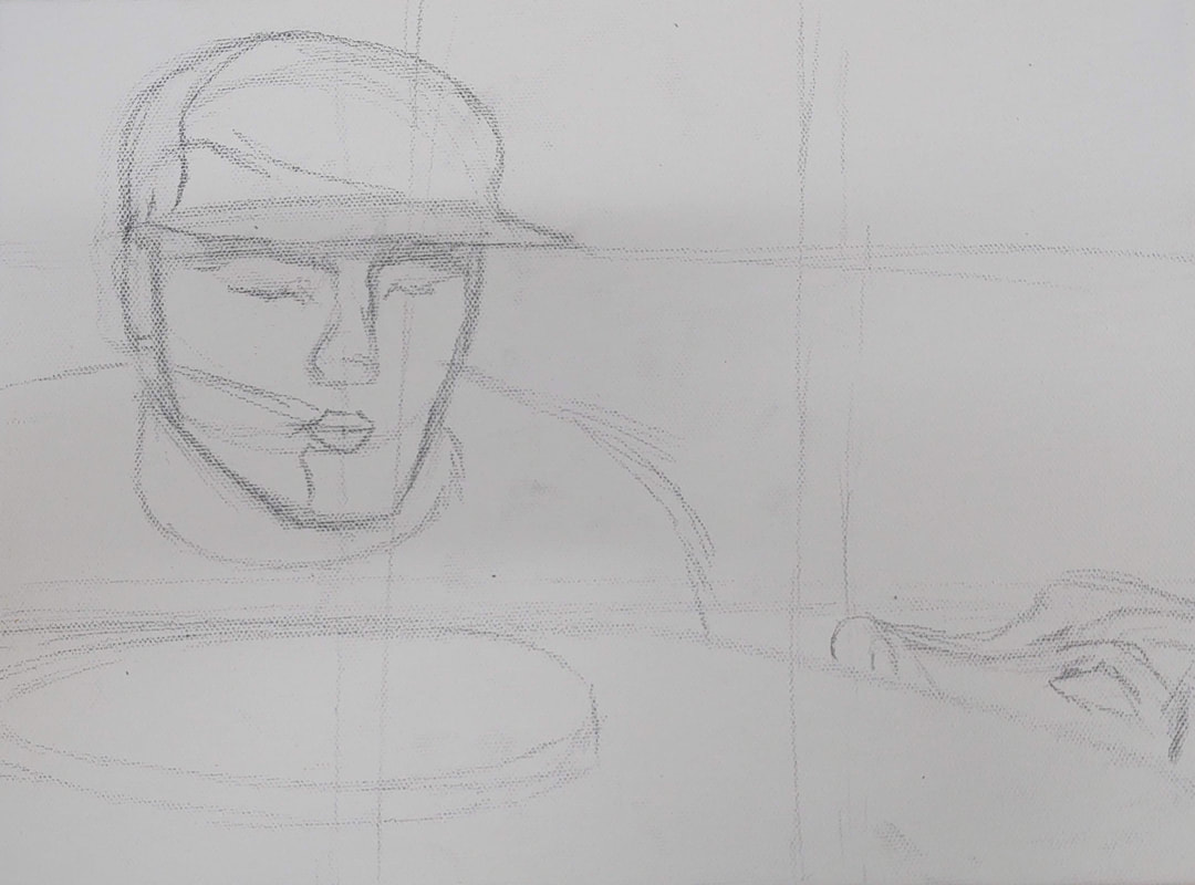
As always, I did a quick practice sketch so that I can better understand the shape and proportions of the subject I'm dealing with. For this, I feel like my practice sketch came out really good as a stand alone study of my subject. Doing this allowed me to achieve the results that I did with my painting.
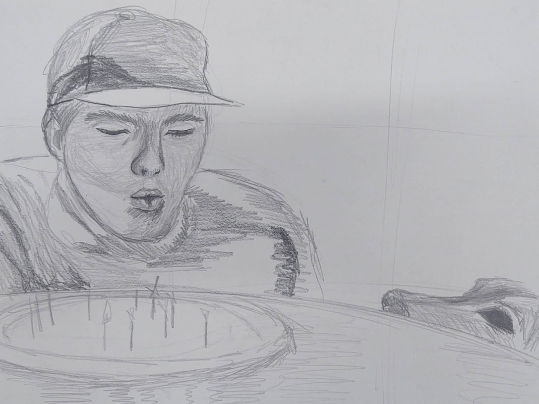
I noticed that in my drawing, that the way his mouth was contorted, caused it to appear to fit within the space between his two eyes rather than his two pupils. I also noticed that I would have to squish his chin and jaw somewhat to account for the way he is posing. Once I completed this sketch I noticed that his hat was drawn to small for his head, so I made sure that I accounted for that in the final painting. I also noticed that I made the dog's eye a bit to large in my drawing, so I also made sure that I didn't mess that up in my final.
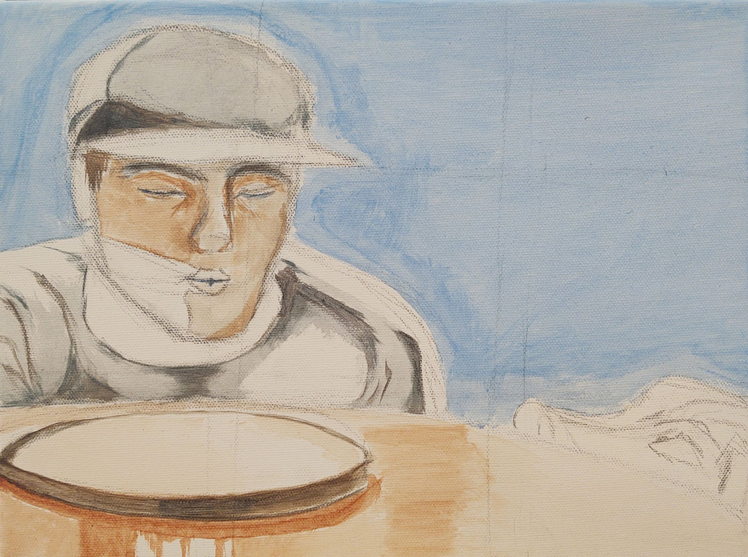
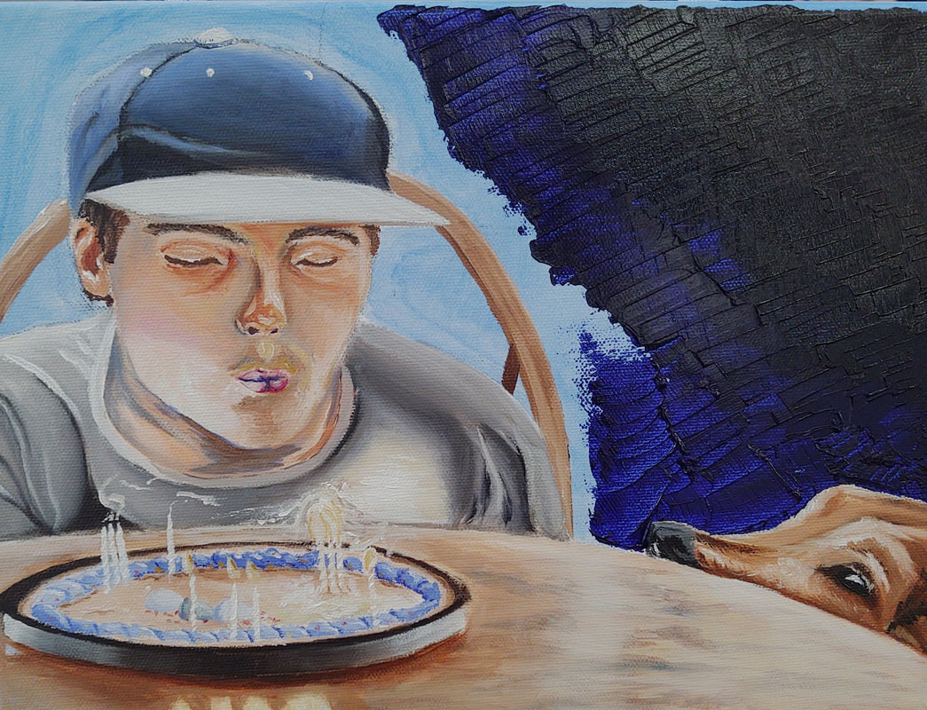
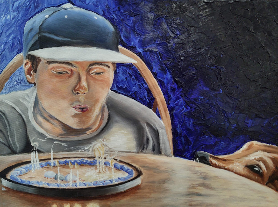
For the painting itself, I prepped the canvas using an two color acrylic wash. I used mainly brown for my subjects and table, and I used blue exclusively for the background, and also used it in combination with brown on the subject's shirt. The wash definitely helped me to establish where I would put my highlights and shadows in the final painting, and I wish that I would have used that on all of my other paintings.
Now for the oil paints, I used exclusively warm colors on the boy so that it could stand out from the rest of the painting which I mainly did in cool colors. Now for the dog and table, I wanted them to be important elements of my painting, but so that they didn't overpower my main subject (the boy) I painted them in exclusively cool colors. The cake was a little tricky to paint since I've never had to recreate, let alone paint, a light source before. So for the cake I ended up using straight up white for the light source which I surrounded with some straight yellow ocher, in order to establish that it was a high contrast area of my painting.
For the background, I used the pallet knife to lay down thick pads of black paint which I faded into straight ultramarine, which I then lightened up as I got to the other end of the canvas. Now the background was the only instance in the whole painting where I used black paint, since my "mock black" was looking a little brown for what I was going for. I'm actually really proud that I was able to achieve the contrast that I did without black paint. To make a "mock black" for his shirt and cake, I mixed together some ultramarine and burnt umber. To fade this into grays like I did in his shirt, I added a little more ultramarine and a lot of titanium white to the existing black.
I'm also really proud of the fact that I really utilized the textures of oil paint in order to make things stand out, or in order to give things texture. For example, I painted the candles using gobs of titanium white which I lightly spread out on the canvas in order to make the candles look striped. I also used this with the dogs fur, and the "boys hair". There are many other instances of this, but these were the main ones that I was proud of.
Now I was attempting to go for a traditional renaissance-ish look with my painting, where the subjects would contain the most color on the canvas, and would vignette around the edges (of the subject) into a black/dark background, and I feel like I achieved the look I was going for with the blending of traditional and modern. I used lots of color on his face, using yellows on his chin so that it looks like the yellow light from the candles are reflecting off of him, and I used blues on the highlight on the left side of his face so that it looked like.
I also ended up doing a lot of repainting on his face, especially on his mouth. First his mouth was too high, then it was too small, then it was too big. It ended up taking 4 or so attempts to get it to the point where I am okay with it, but still leaves something to be desired. I also feel like his nose is a tad bit too small, but it's nothing too abhorrent.
Lastly I'm also really proud that I was able to paint this with less than two weeks of class time to work on it. I am becoming a better and faster painter which is going to set me up for success in future art classes.
Enough rambling: as my last project done in Art 3, I just want to say that I am extremely happy that I ended up taking this class (not listening to Mrs. Rossi's suggestion) because I feel like I really found myself as an artist this semester. I'm really glad that I experimented more with paint mediums and expanded my artistic horizons. I really enjoy the self guided aspect of her class, and while it's definitely not for everyone (especially people who aren't very self motivated), it definitely worked for me and allowed me a degree of artistic freedom which was very much appreciated.
December 20th 2019
|
|
|
|
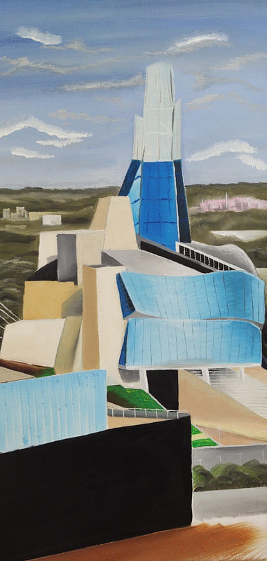
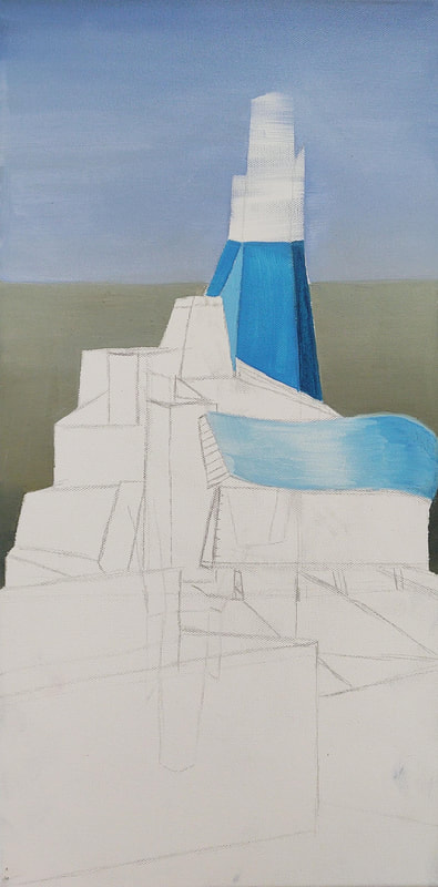
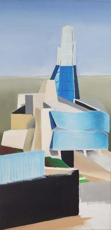
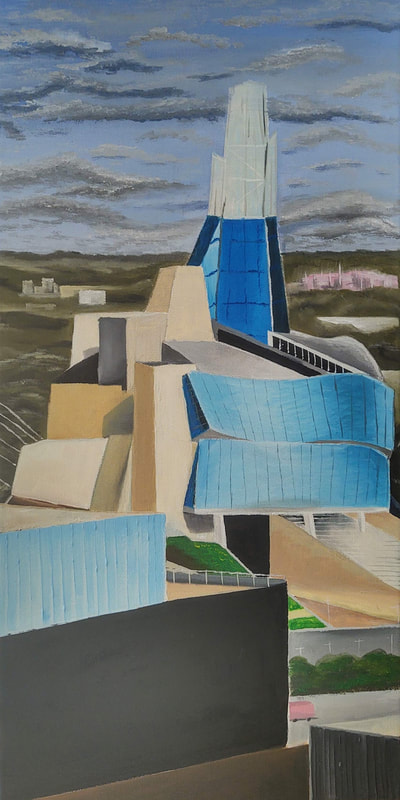
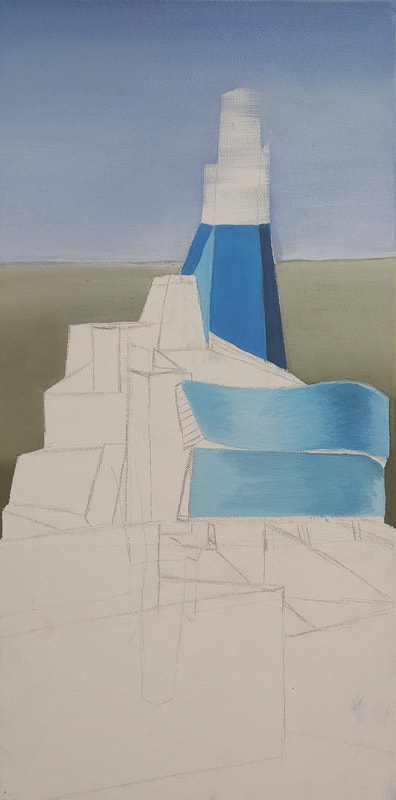
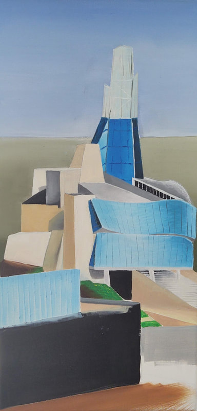
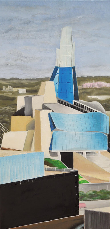
I spent about 24 school days working on this piece, and I am quite proud of it. I feel like this is a huge step up from my previous painting in terms of my technical art abilities. I was mindful of how warm and cool colors affected the depth of the piece, and I took into consideration how the composition of the elements in the piece would affect the outcome. For my first oil painting I'm super satisfied with how it turned out and I'm glad that I decided to leap out of my comfort zone by exploring this new medium. Before I painted this painting, I did a practice painting of a toy block, which ended up helping me figure out how to use this new medium. In all, I really enjoy using oil paint, more so than acrylic, and I'm looking forward to my next piece.
November 19th 2019
|
|
|
|
|
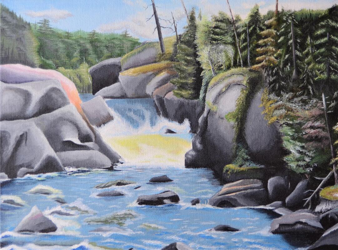
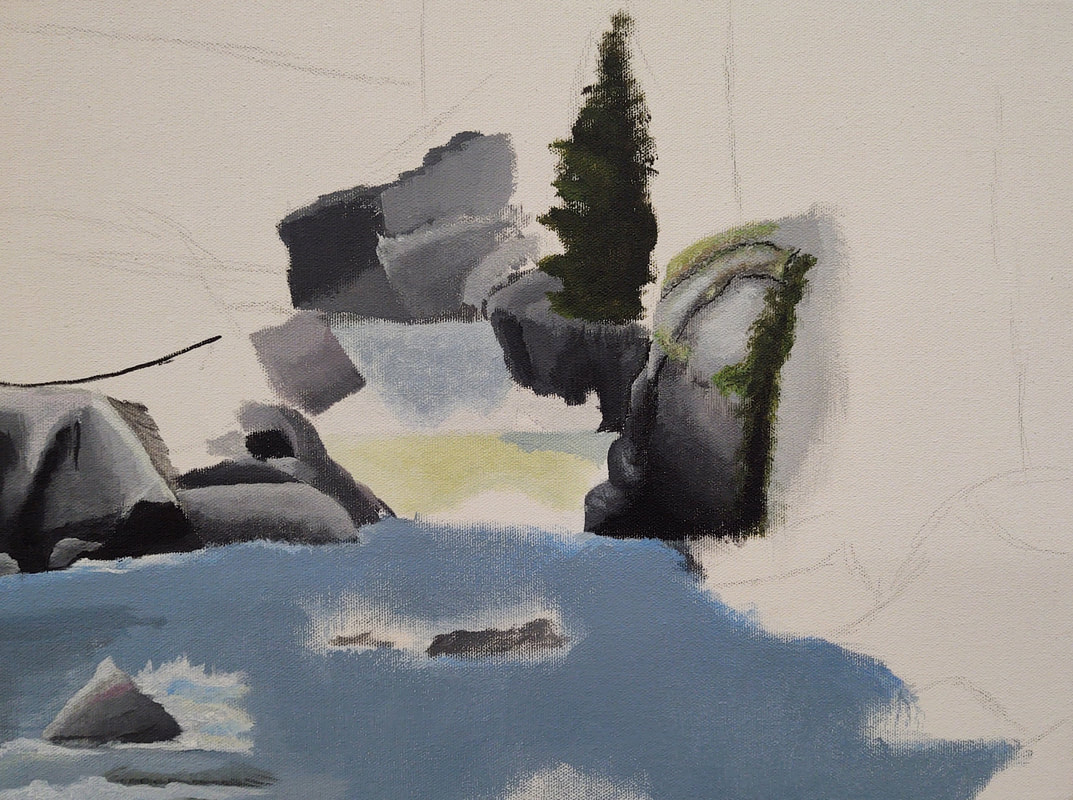
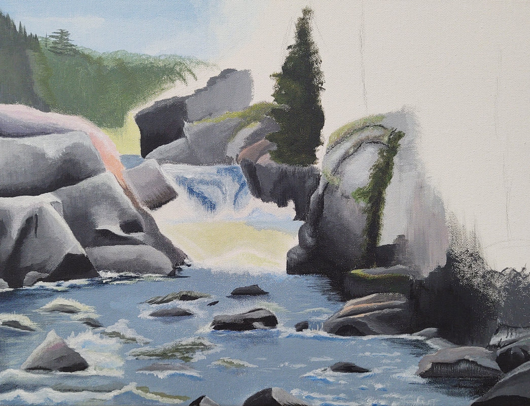
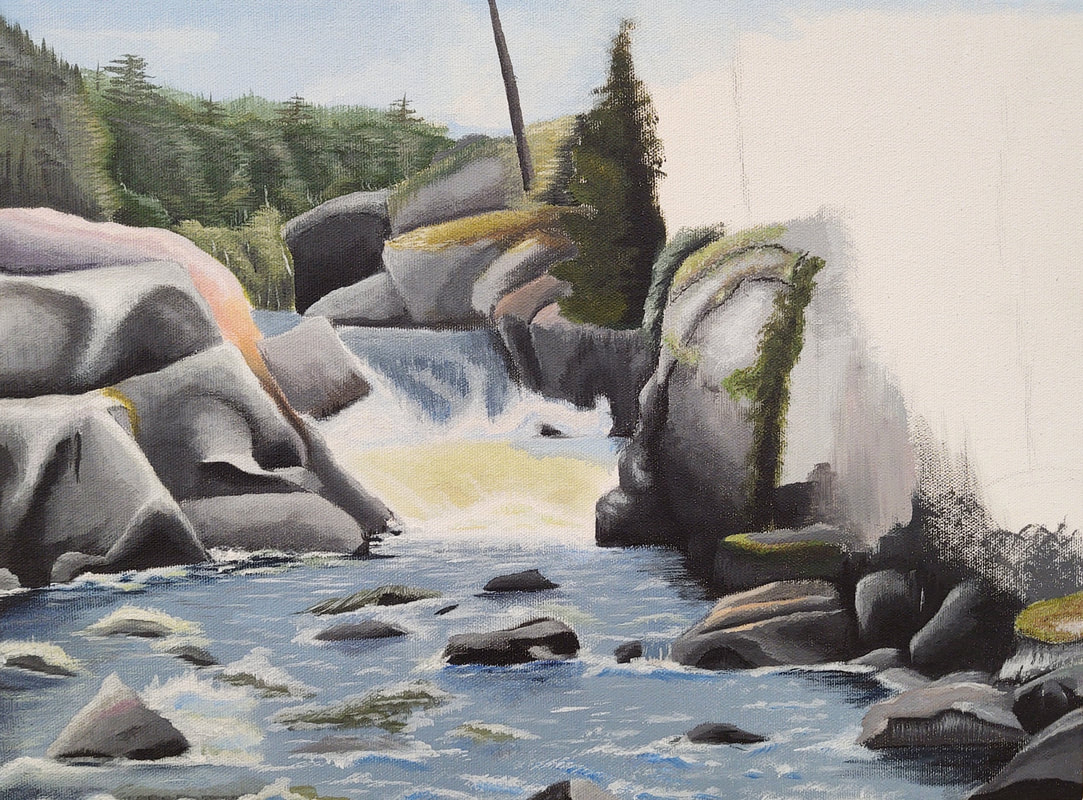
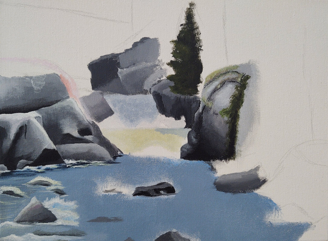
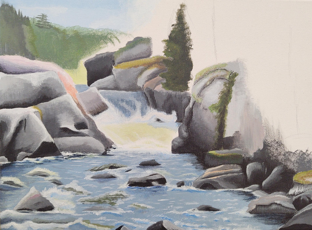
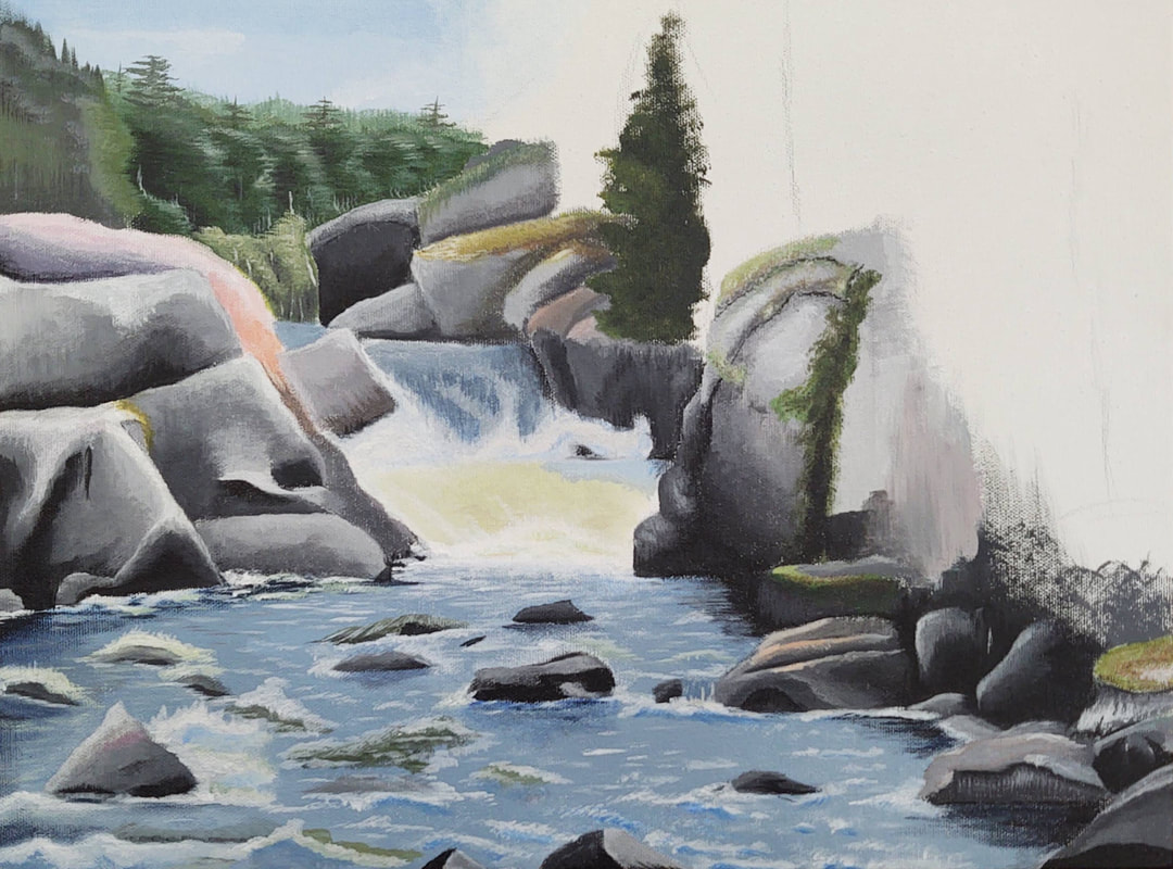
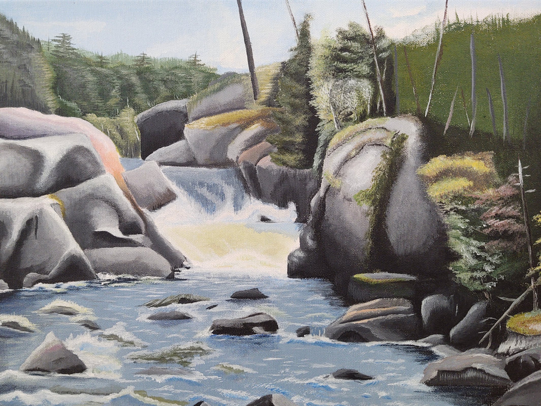
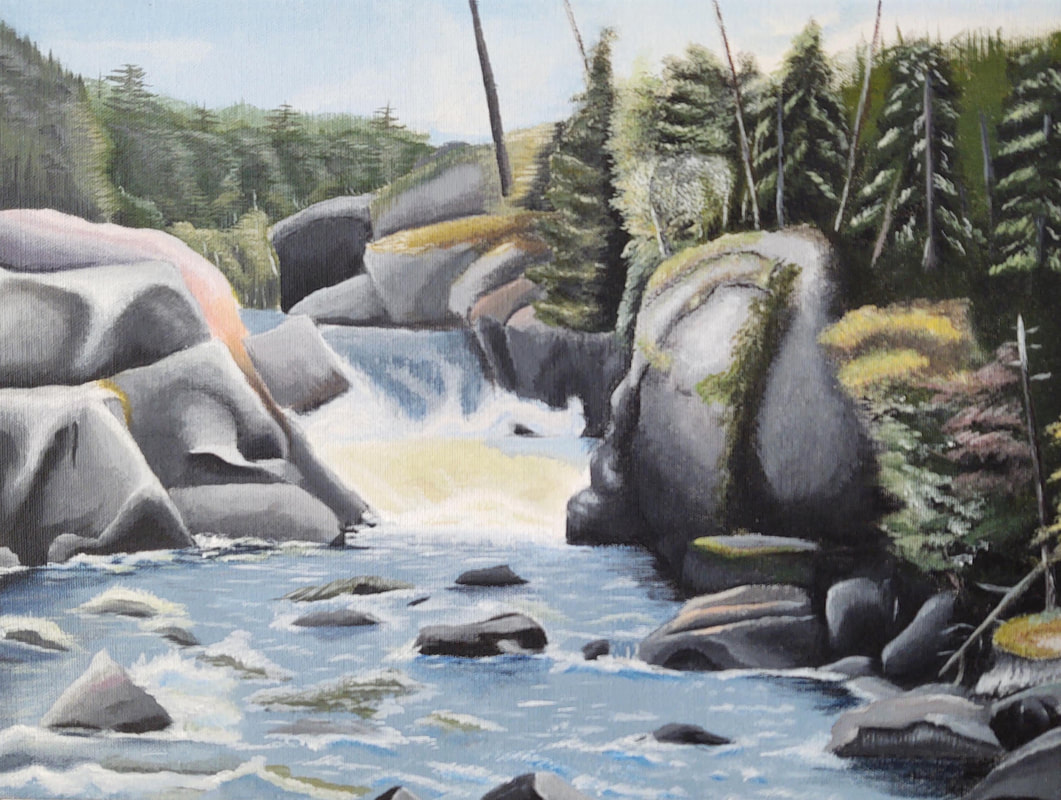
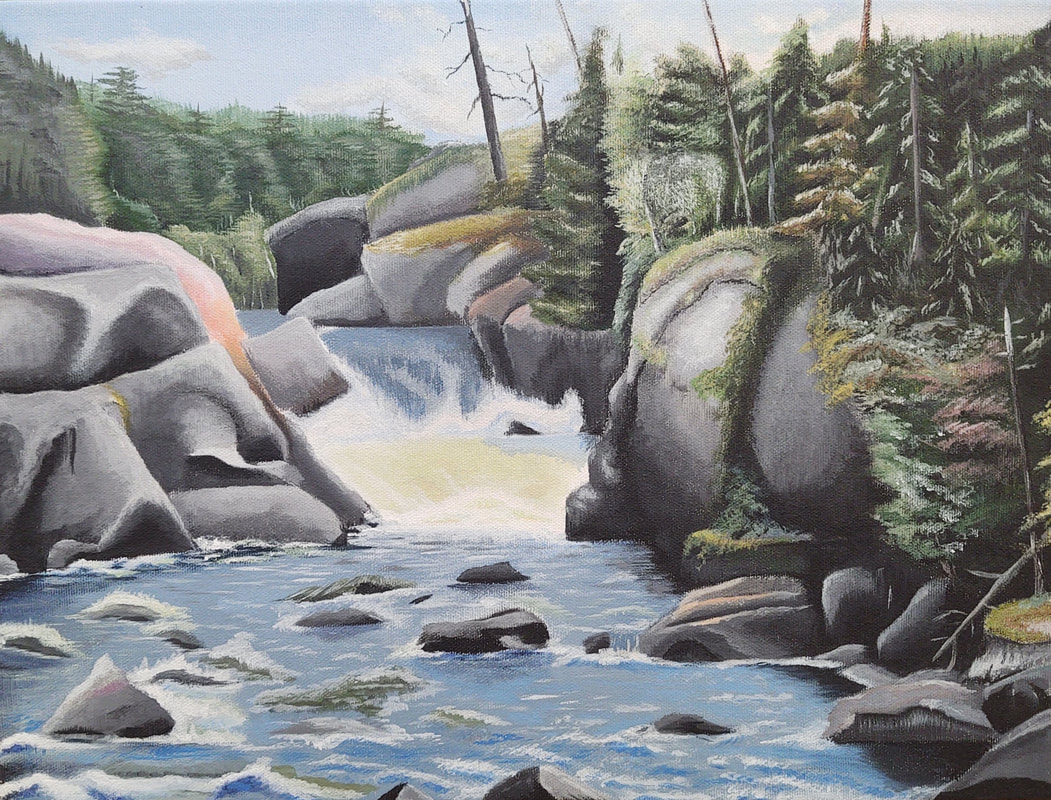
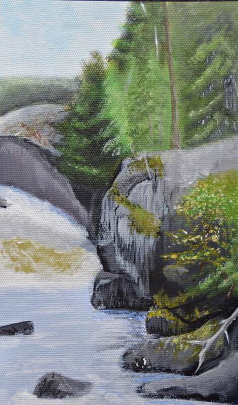
After finishing the Svech drawing, coming up with a new idea was pretty difficult, so I asked Mrs. Purtee to assign me a theme. The theme she came up with was "Stories Through Places". Fitting with the theme, I chose to recreate a photo that was taken during my trip to Canada that I took over the summer. I wanted to expand my artistic horizons so I decided to paint the picture using acrylic paint. This was the first painting I had done since first semester of freshman year (Art 1), so taking on the challenge of an acrylic painting was daunting at first. After doing a practice painting of my reference photo (below) I felt a lot more comfortable using the medium. In all, I'm pretty happy with how it turned out. I feel like the trees on the right most side don't recede that much, and the rocks on the left side could use some more depth too. I feel like the water, however, looks pretty realistic, and that the trees in the background look far away, like "the sun is cascading over them," as Mrs. Purtee said.
October 18th 2019
|
|
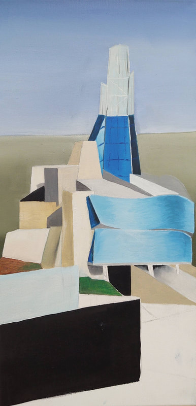
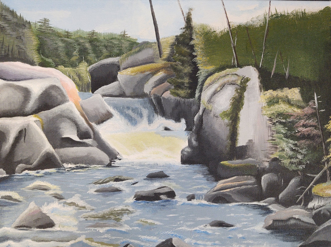
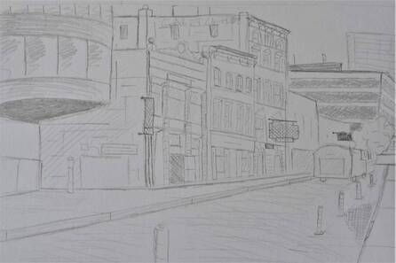
Since finishing my prisma drawing, it took a while to generate new ideas for what I'd like to peruse next. To kill time I did a quick pen and ink, and a perspective piece. After sitting down and talking to Mrs. Purtee, we decided that I should go outside of my comfort zone and peruse a painting. I painted a small section of my reference photo, which I'll use on my final piece, and I feel like it came out great given that I haven't painted in two years.
October 4th 2019
|
|
|
|
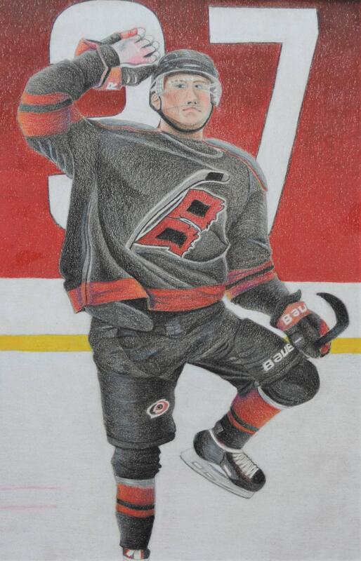
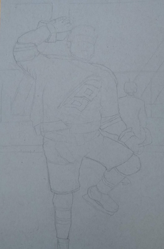
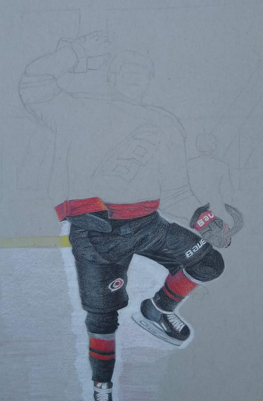
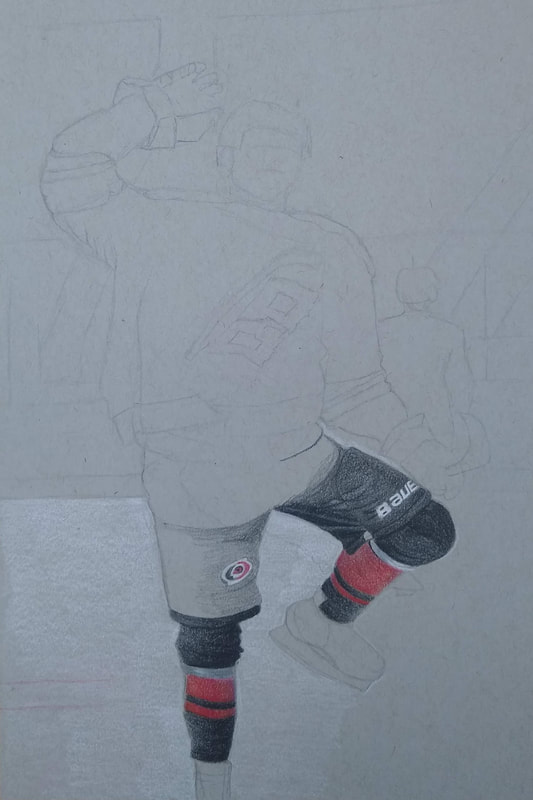
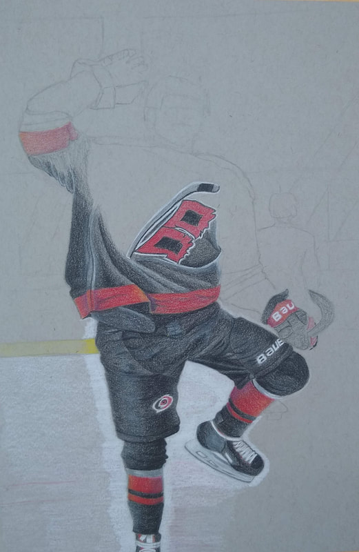
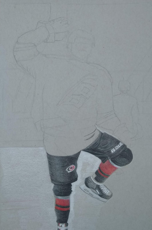
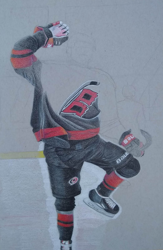
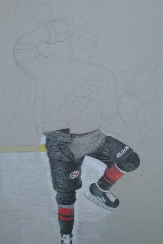
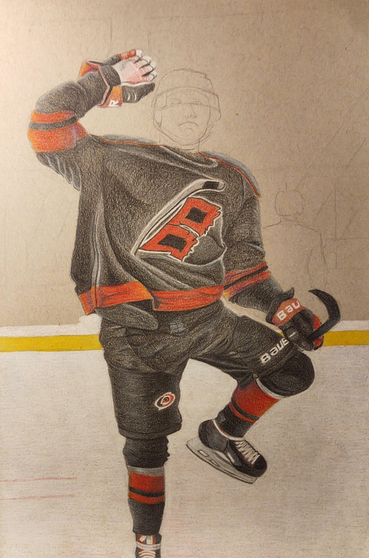
Over the last two weeks or so, I've been working on a prisma drawing of a hockey player. I feel like the body and background turned out very well, though I'm a little disappointed about the face. It took several attempts to sketch the face out the way I liked it in pencil before coloring it in. Even though I thought that the penciled in face looked alright, after I had filled it in with prisma, I realized that the eyes were a bit too high on his face, and a bit too close to the bridge of his nose. This was the part of the drawing that I really wanted to get dead on, since the face is the first thing that people look at when looking at this piece, and its unfortunate that I couldn't get it right.
Though the face looks a bit wonky, it still looks like a face, and without looking at the source material, you would think that you are just looking at a very ugly hockey player.
This piece was also submitted into a student art contest at the NC State Fair, so I'm hoping the judges can overlook the face.
September 16th 2019
|
|
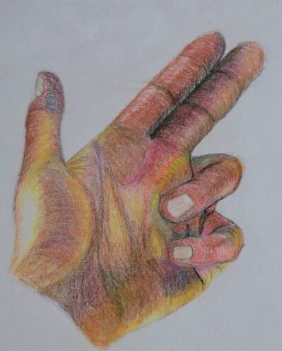
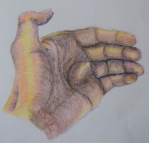
Over the last two weeks, we have been practicing figure drawing. We drew many, quick practice drawings using real life and photo models. I chose to spend some time improving my hand drawing skills, so I did several quick drawings using my hand as a model. I then drew two hands in much more detail, and took a somewhat stylized approach. Each hand took me about a class period and a half to complete. I would like to start on a bigger figure drawing project, but I'm not quite sure how I'd like to approach things yet.
